
Seasonal colour palette
Here you will find 12 seasonal color palettes, each one collecting the shades of its season on a card you can save.
Everything in one go: all 12 palettes (ZIP), every HEX code (CSV).
Spring color palettes
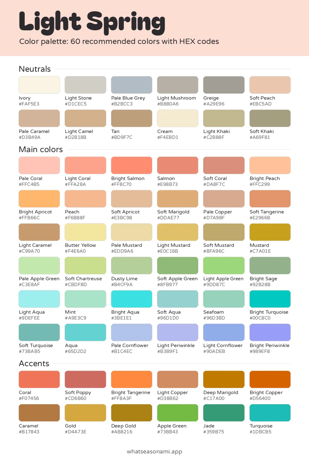
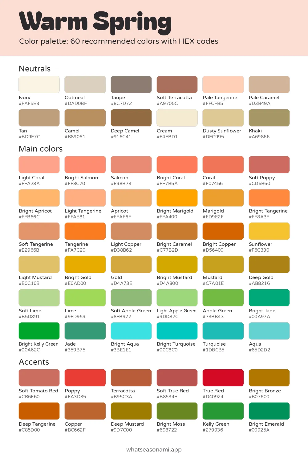
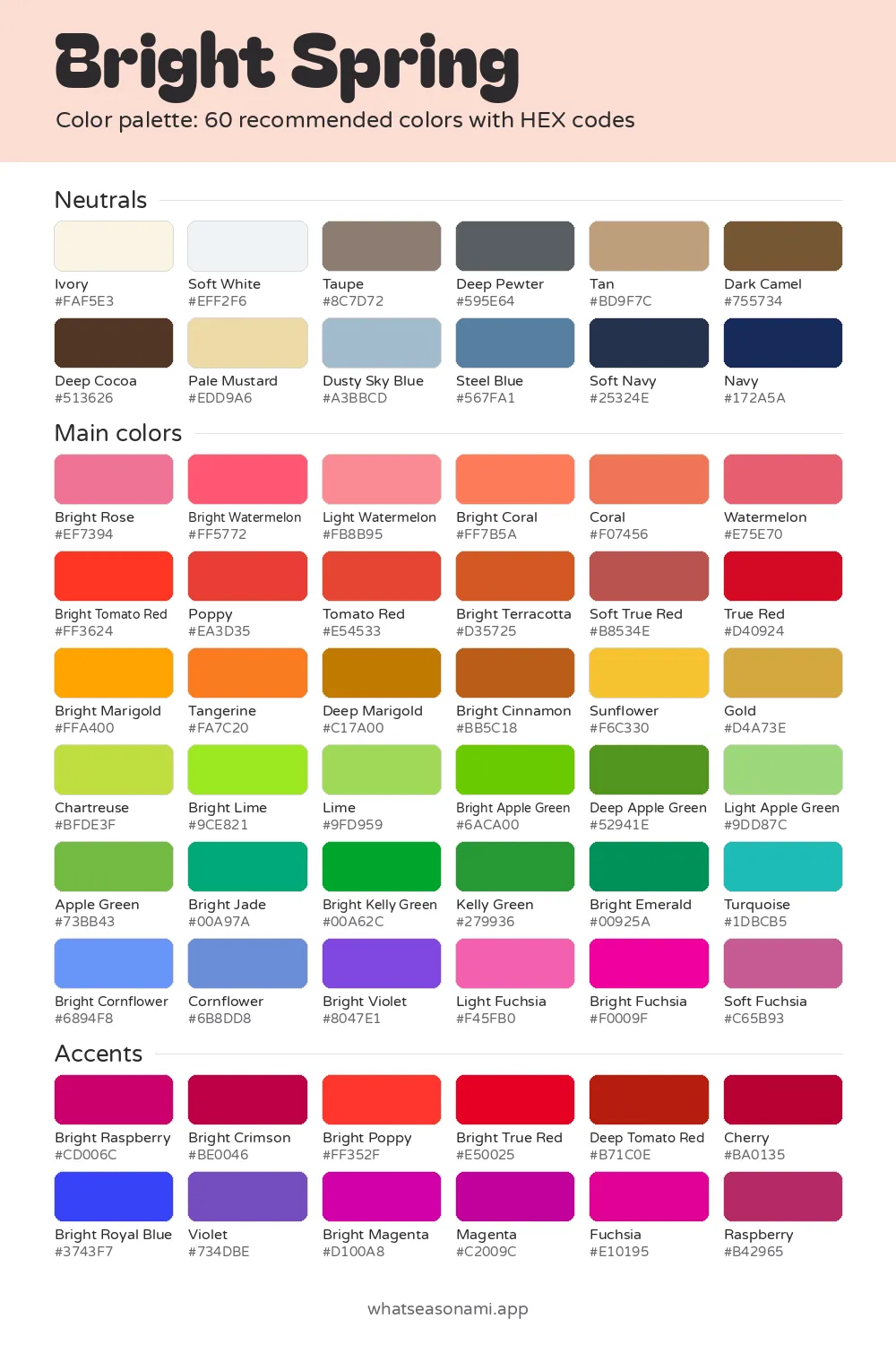
Summer color palettes
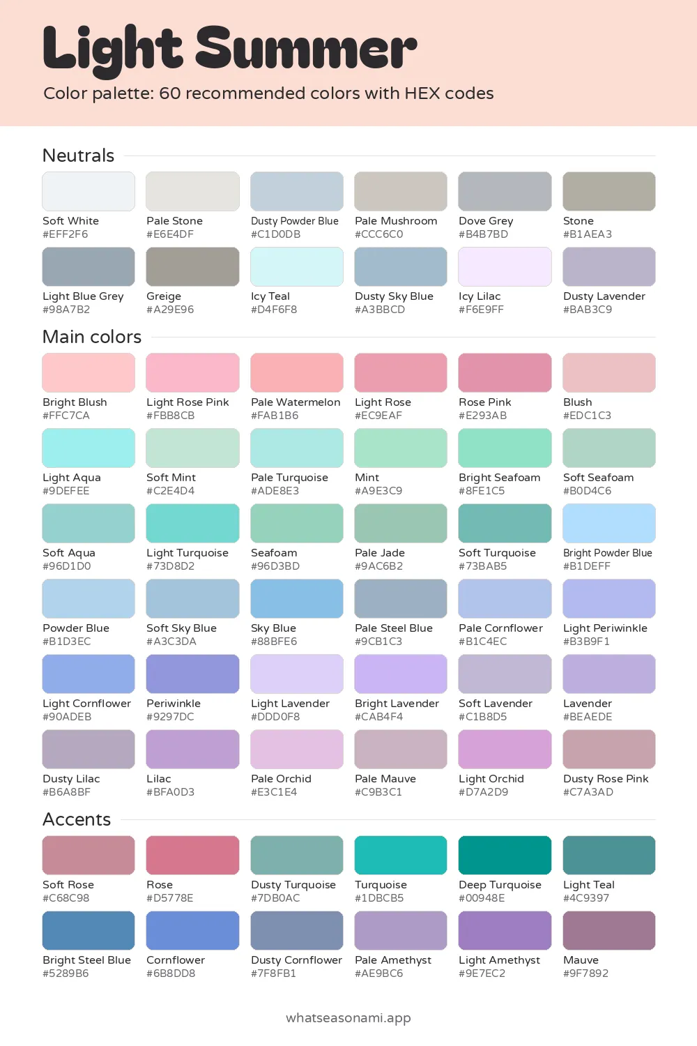
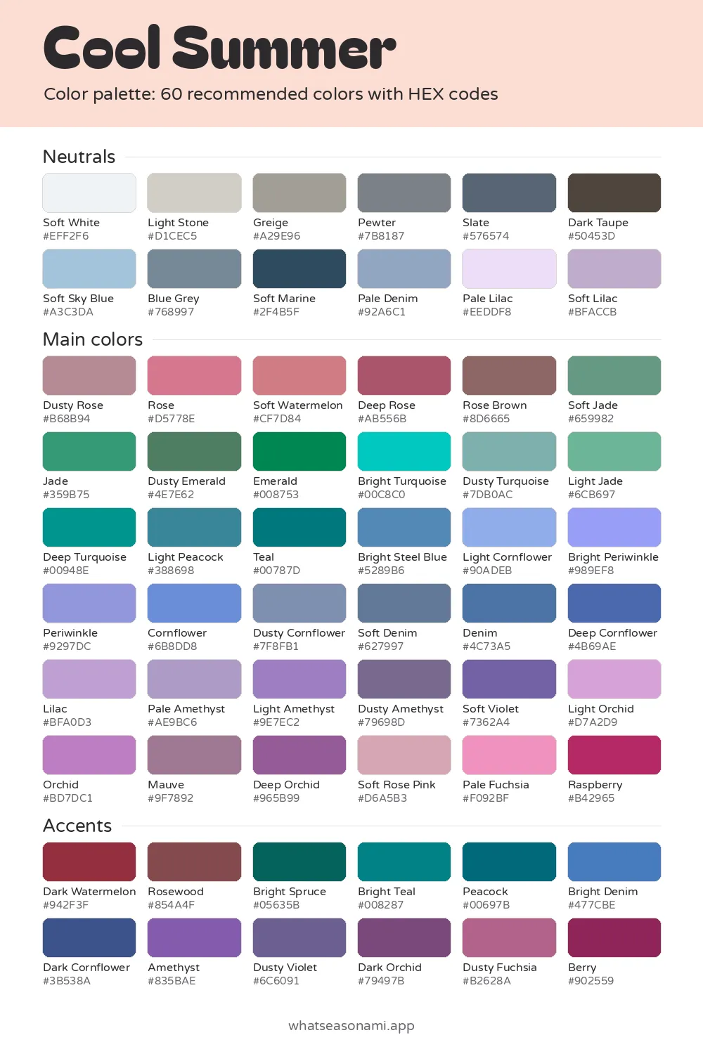
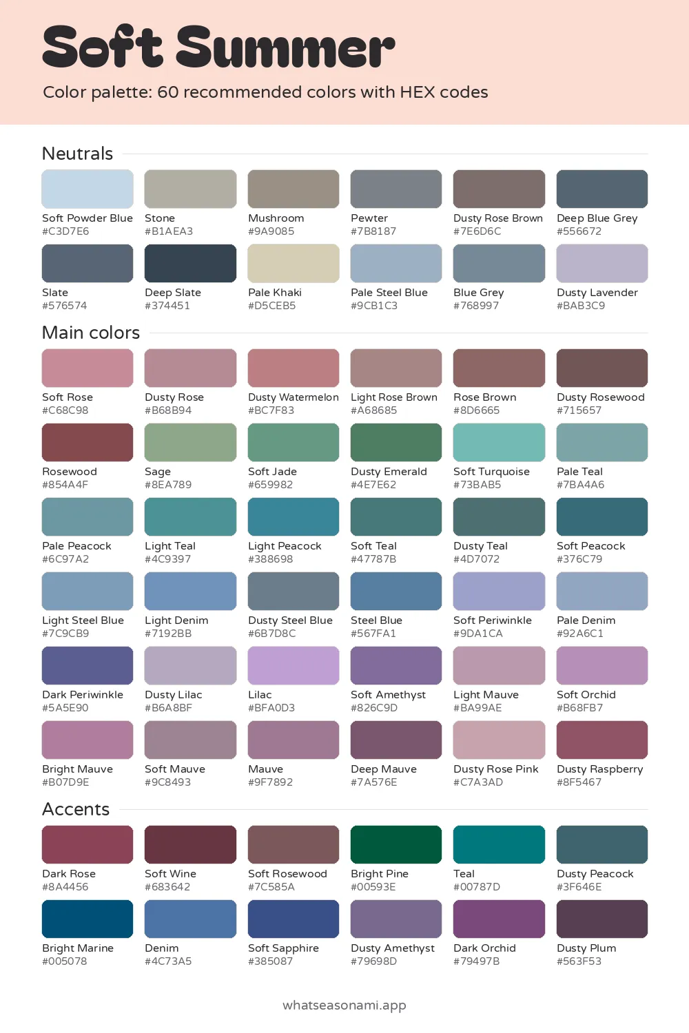
Autumn color palettes
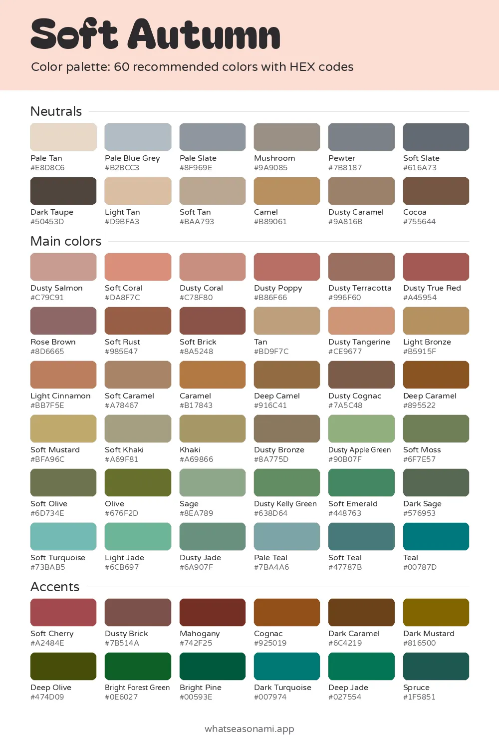
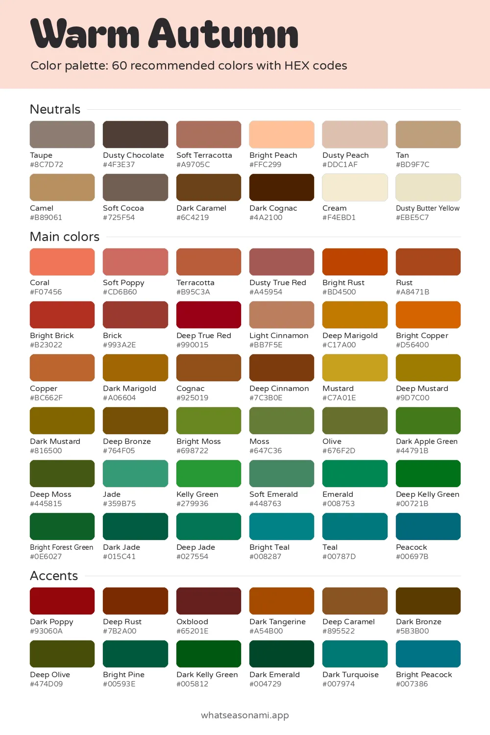
Winter color palettes
- Seasons covered: twelve, grouped into 4 families
- Colors in each palette: 60 named shades, each with a HEX code
- Downloads offered: a PNG card, a CSV list, Adobe ASE swatches and Procreate swatches
- Cost: nothing; no photo, email or account required
Three quick questions are enough to find your season, and from there the card lives on your phone for shopping trips or heads straight over to any design app.
Your colour season palette
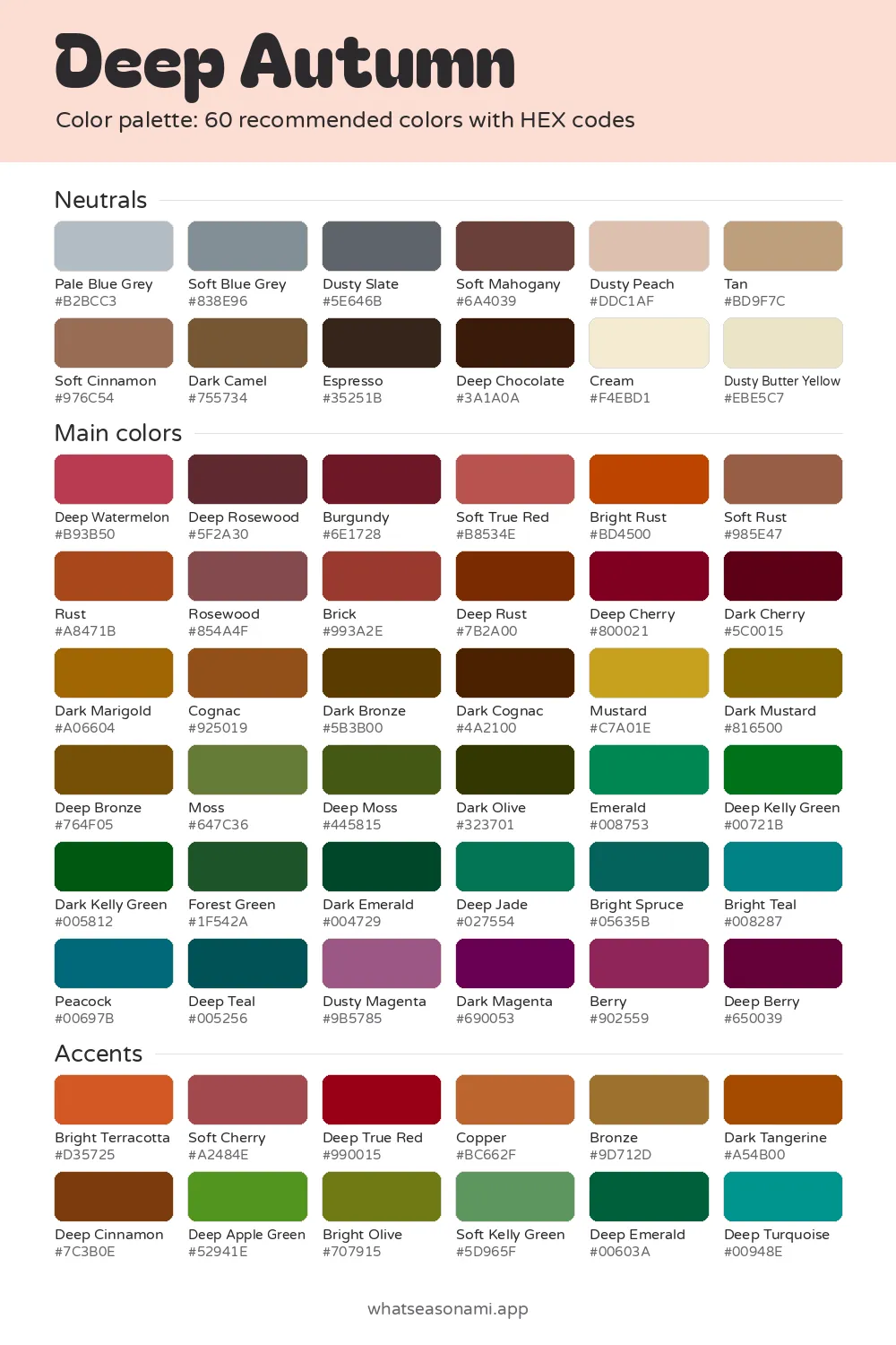
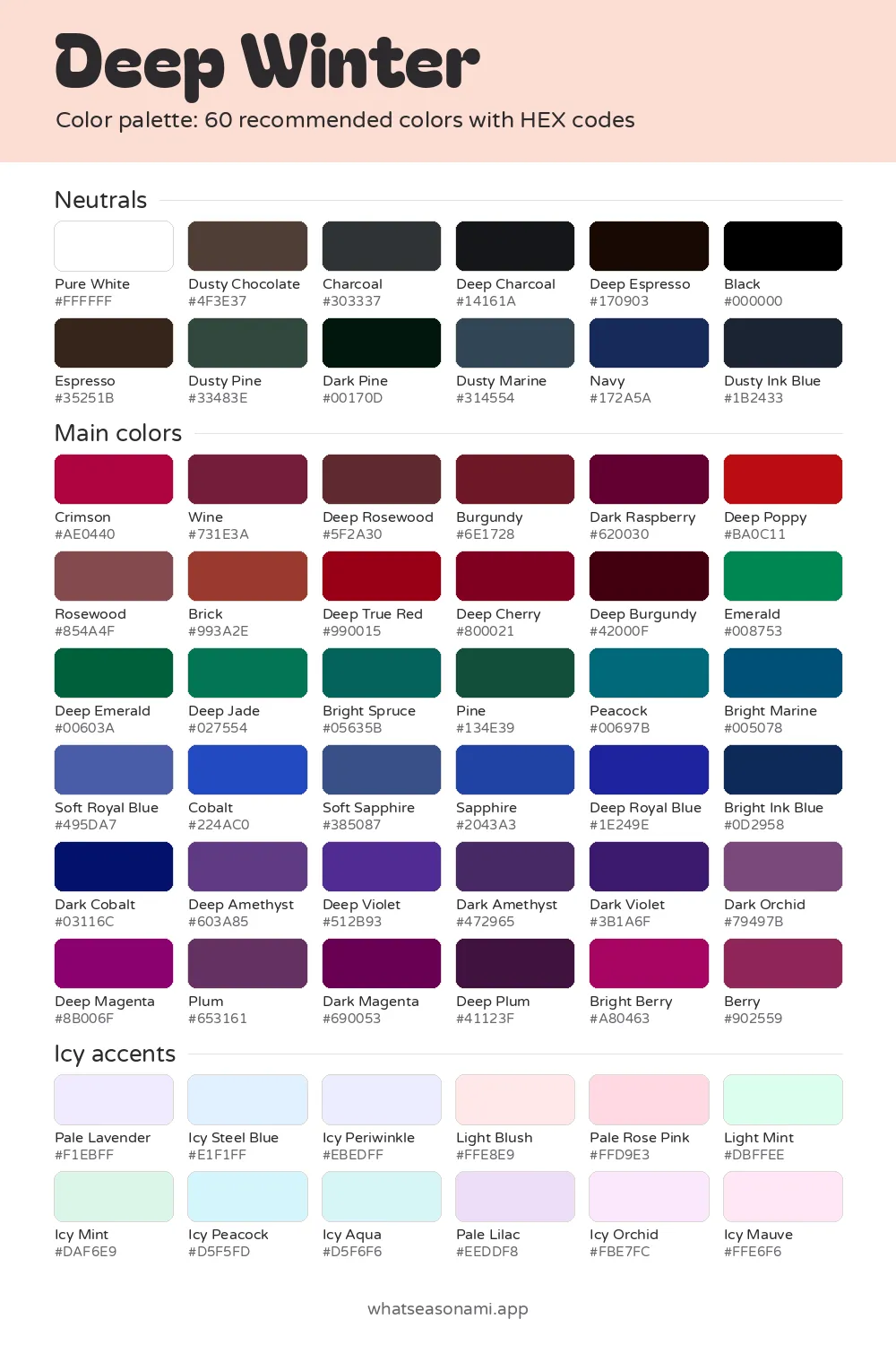
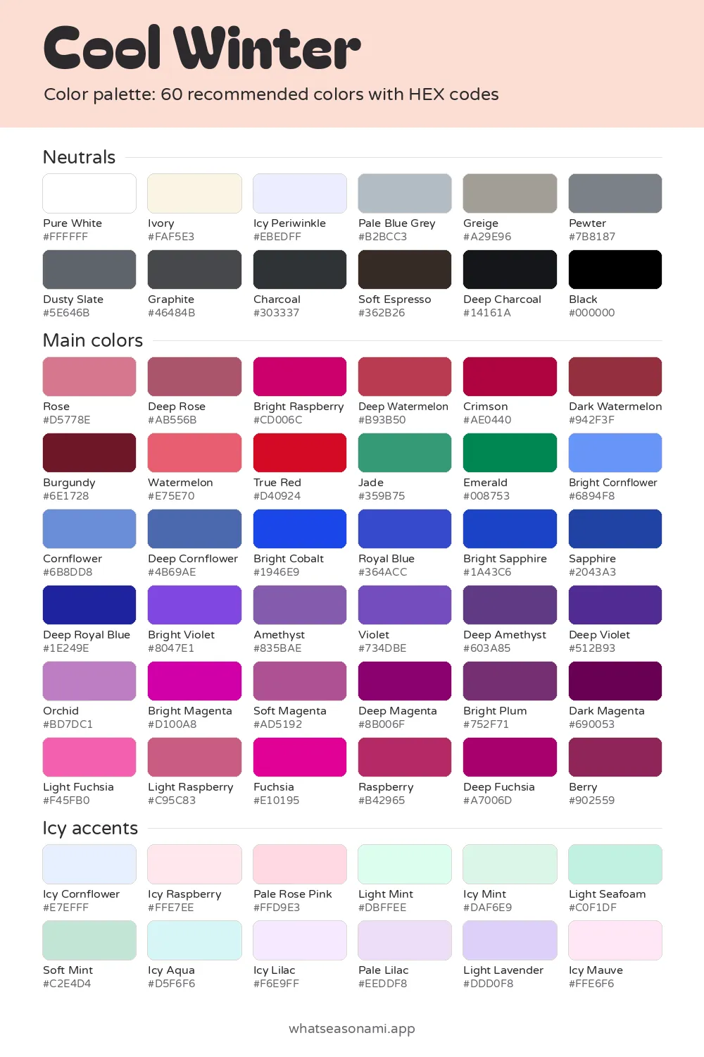
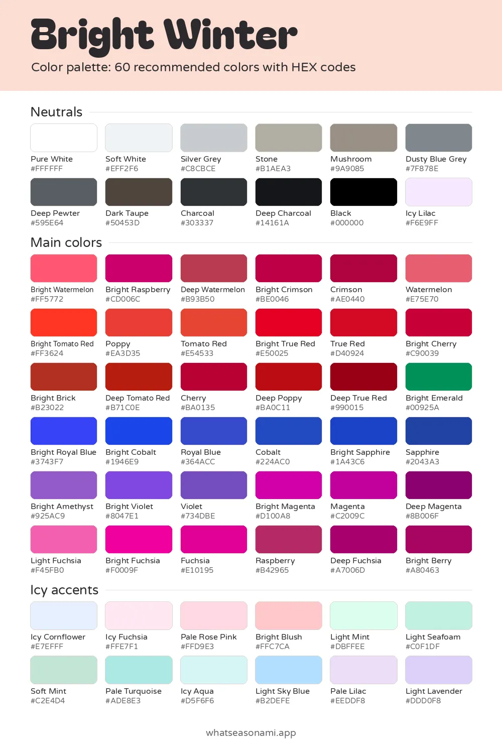
There is one palette per season, so once you know yours, one card is all you need. Every palette contains 60 named colors sorted into 3 groups: neutrals, main colors and accents. Colors you should skip get listed too.
Each color carries a HEX code. It is a short mix of letters and numbers that tells any screen or program the exact shade to display.
How the 12 seasons palette is arranged
Four families make up the 12 seasons: spring, summer, autumn and winter. Three seasons belong to each family, and each one takes its name from its most defining trait: think light or deep, warm or cool, bright or soft.
| Family | Its seasons |
|---|---|
| Spring | The light, warm and bright versions of spring |
| Summer | The light, cool and soft versions of summer |
| Autumn | The soft, warm and deep versions of autumn |
| Winter | The deep, cool and bright versions of winter |
Shades for spring
- Light spring brings you butter yellow, bright peach, light aqua, light coral and soft apple green.
- Warm spring works with coral, bright marigold, apple green, bright turquoise and poppy.
- Bright spring leans on bright coral, poppy, turquoise, bright lime and bright royal blue.
Shades for summer
- Light summer offers powder blue, soft mint, light lavender, light rose pink and pale watermelon.
- Cool summer favors dusty rose, cornflower, soft jade, raspberry and orchid.
- Soft summer runs on dusty rose, sage, soft mauve, dusty teal and soft wine.
Shades for autumn (fall)
- Soft autumn pairs sage with dusty terracotta, rose brown, soft mustard and soft teal.
- Warm autumn is built around rust, mustard, olive, terracotta and teal.
- Deep autumn goes for deep rust, forest green, burgundy, dark mustard and deep teal.
Shades for winter
- Deep winter centers on dark violet, deep burgundy, deep cherry, deep emerald and sapphire.
- Cool winter features true red, emerald, bright cobalt, fuchsia and icy lilac.
- Bright winter carries bright true red, bright magenta, bright cobalt, bright emerald and icy aqua.
Trying the palettes as color analysis swatches
You can hold these palettes up as swatches and test them near your face. Stand close to a window during the day, put your phone screen or a printed card beside your face, and check a few seasons against each other. Daylight wins over indoor bulbs, since bulbs change the way skin tones read.
Is there a color palette test and finder that's free?
Yes, and it costs nothing. A quiz sits on the home page with 3 questions, shown one at a time. It asks if gold or silver flatters you more, whether your features run light, medium or deep, and if bright or soft colors work better near your face.
Depth describes how dark or light the set of your hair, eyes and skin is. Clarity describes whether crisp, vivid colors or gentler, muted ones suit you more. Your answers pick out one of the 12 seasons and send you to the matching card.
Getting and working with the files
Every season has free files, and there is a zip with all 12 bundled together.
- PNG palette card: set it as the wallpaper on your phone and your colors will be on hand for every shopping trip.
- CSV HEX list: a simple list of all the HEX codes, handy for spreadsheets or design projects.
- Adobe ASE swatches: for bringing the colors into Adobe programs.
- Procreate files: a pair of swatch sets made for iPad drawing.
To load a palette into Procreate on your iPad:
- Move the swatches file into the Files app.
- Open the downloaded file with one tap and it will load in Procreate.
- Look inside the Procreate color panel's palettes tab and your new palette should be waiting there.
Common questions
How can I find my colour season palette with no photo?
No photo, upload, camera, email or account is needed for the quiz, and everything you answer stays inside your browser. Because phone cameras distort skin tones, a mirror in daylight gives you a fairer read than your phone ever could.
Why does the same shade turn up in several seasons?
When two seasons share a trait, they can share colors too. Dusty rose, for instance, belongs to both cool summer and soft summer. Sage belongs to soft summer and soft autumn, two seasons that are both soft.
Why do the swatches I downloaded look different on my phone?
Lighting and screens both affect how a color appears, so the same swatch may seem warmer or flatter depending on where you view it. For comparison, a printed card checked in daylight is the more reliable option.
What if the result from the quiz doesn't feel right?
Treat a quiz as a first step. You can check the result yourself with the swatches and a mirror in daylight, or book an in-person draping session. The site offers other free tests as well: an undertone test, a gold versus silver test and a hair color test among them.