
Warm Spring color palette
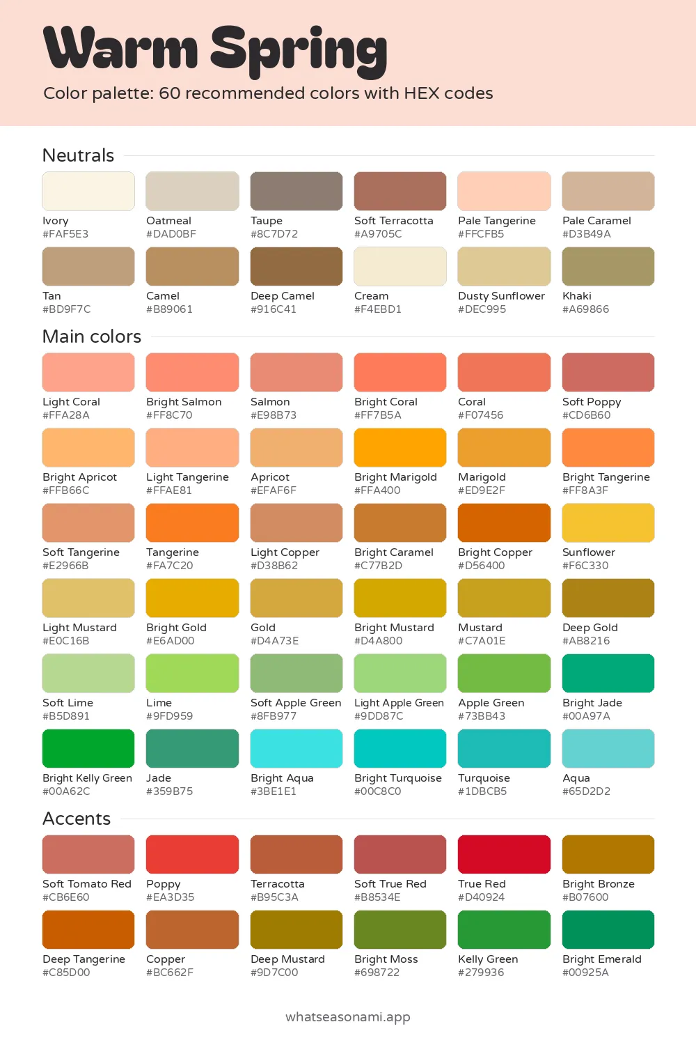
Picture 60 sunny, medium-depth shades and you have the warm spring color palette. Each one starts from a clear golden yellow base, and none of them carries a cool undertone.
Warm Spring neutrals
- Ivory
- Cream
- Pale Tangerine
- Oatmeal
- Dusty Sunflower
- Pale Caramel
- Tan
- Camel
- Khaki
- Soft Terracotta
- Taupe
- Deep Camel
Warm Spring main colors
Reds and pinks
- Light Coral
- Bright Salmon
- Salmon
- Bright Coral
- Coral
- Soft Poppy
Oranges and browns
- Light Tangerine
- Bright Apricot
- Apricot
- Soft Tangerine
- Light Mustard
- Bright Tangerine
- Light Copper
- Sunflower
- Marigold
- Tangerine
- Gold
- Bright Marigold
- Bright Caramel
- Bright Copper
- Deep Gold
Golds and olives
- Bright Gold
- Mustard
- Bright Mustard
Greens
- Soft Lime
- Light Apple Green
- Lime
- Soft Apple Green
- Apple Green
- Jade
- Bright Jade
- Bright Kelly Green
Blues and teals
- Aqua
- Bright Aqua
- Turquoise
- Bright Turquoise
Warm Spring accent colors
- True Red
- Poppy
- Soft True Red
- Soft Tomato Red
- Terracotta
- Copper
- Deep Tangerine
- Bright Bronze
- Deep Mustard
- Bright Moss
- Kelly Green
- Bright Emerald
Free files: palette card (WebP), HEX list (CSV), Adobe swatches (ASE), Procreate part 1, Procreate part 2. Tap any HEX code to copy it.
Colors to avoid as a Warm Spring
- Rose#D5778E
- Black#000000
- Bright Cobalt#1946E9
- Emerald#008753
- Teal#00787D
- Lilac#BFA0D3
- Dark Rose#8A4456
- Soft Turquoise#73BAB5
It's made for skin with a golden or peachy glow, where hair, skin and eyes contrast with each other in a lively, medium way.
- Other name: True Spring
- Top neutral: Camel
- Best metals for jewelry: yellow gold and brass
- Shades to skip: 6
Do Warm Spring and True Spring share one palette?
It is: the 2 names point to the same season. There are 12 seasons in total, and they grow out of 4 families: spring, summer, autumn and winter. Every family divides into 3 seasons, and each of those seasons takes its name from the trait that dominates it.
Warmth dominates here, making this the most golden of the 3 springs. Brightness comes second, and that's why the shades read clear instead of muted.
Warmth, depth and clarity in the palette
Three traits describe any color in this palette. The first is temperature, meaning whether a shade leans golden or icy. Here the answer is always golden. The second is depth, meaning how light or dark a shade sits. This palette stays in the middle, with no very pale shades and no very deep ones.
The third trait is clarity, which is about whether a color looks clean or soft. Warm Spring shades are bright and clean, the way fruit or flowers look in sunshine, not greyed or dull.
Your coloring shares these traits. The warm tone glowing up from just beneath your skin's surface is a golden or peachy one. Shades with the same golden base settle into that undertone rather than working against it.
Neutral shades to wear every day
Twelve neutrals belong to you: camel, cream, ivory, oatmeal, khaki, taupe, tan, deep camel, pale caramel, soft terracotta, pale tangerine and dusty sunflower. Reach for these when buying coats, trousers, bags and other pieces that get heavy rotation.
Two swaps make the biggest difference: deep camel takes the place of harsh black, and cream replaces pure white. On days you'd normally grab something cool grey, tan or khaki will do the same work and keep your skin glowing warm.
Camel beats all the other neutrals. A jacket or coat in camel pairs well with almost every main color and accent here, so it's a smart first purchase. For soft backgrounds under brighter tops, turn to ivory, oatmeal or pale caramel.
Picking main colors and accents
Shirts, sweaters and dresses sit near your face, and that's where the main colors belong. They sort into a handful of simple groups:
- Corals and salmons: think Light Coral, Bright Salmon, Coral
- Apricots and tangerines: think Bright Apricot, Light Tangerine, Tangerine
- Golds and mustards: think Sunflower, Bright Gold, Light Mustard
- Fresh greens: think Soft Lime, Apple Green, Bright Jade
- Clear blue greens: think Aqua, Bright Aqua, Bright Turquoise
Five shades make up your signature set: poppy, bright turquoise, apple green, bright marigold and coral. Building a wardrobe from nothing? Start with these.
Accents, all 12 of them, work best in small amounts: a scarf, a bag, shoes, a lipstick. The dozen include bright emerald, kelly green, bright bronze, copper, soft tomato red, true red and poppy. One accent plus one neutral (camel under poppy, say) keeps an outfit lively but never busy.
Colors to skip and why
Six shades to keep away from your face: Black, Rose, Bright Cobalt, Lilac, Dark Rose, Teal. None carries the golden foundation your coloring thrives on, so each one ends up sitting apart from you instead of with you.
- Black worn near your face can drain your skin to sallow and darken the circles beneath your eyes.
- Both Rose and Dark Rose sit on a cool pink base that clashes with your peachy warmth.
- As a cool lavender, Lilac and its relatives can wash your lips out and leave them pale.
- Teal and Bright Cobalt lack the golden foundation behind your own blue greens: Aqua and Bright Turquoise.
Own something in black or rose already? Keep wearing it, just farther from your face, in trousers or shoes for example.
How to tell this palette is yours
Skin in this season might show golden freckles over a peachy ivory or cream, or a golden-to-apricot undertone beneath light-to-medium beige; it might also run to warm bronze, honey brown or a rich golden brown. Hair usually lands among strawberry blonde, copper red, golden and honey blonde, golden brown touched with copper, or chestnut showing golden highlights.
Eyes in this season often look clear as glass, with golden flecks or a sunny burst ringing the pupil. Usual eye colors run to warm turquoise, aqua, clear olive, golden green, light hazel flecked with amber, warm topaz and golden brown.
Some everyday checks point in the same direction:
- Yellow gold jewelry settles into your skin and warms it, while silver reads cold and separate.
- A coral or peach lipstick lifts your whole face with barely any eye makeup.
- Camel and warm cream bring out your eyes better than stark white ever will.
Treat a quiz as a first step only. Checking your reflection in daylight, or getting draped in person by a professional, can settle the question. During draping, a trained person drapes colored fabrics below your chin and watches which ones flatter.
Taking your palette shopping
Both phone cameras and indoor bulbs change how colors appear, so don't trust store lighting. Take the garment over to a window, or head outside, and press the matching swatch on your phone right up against the fabric.
Feel the dye for its warmth. A green that reads piney or a red that reads like berries is leaning cool, and that pushes it outside this palette.
Common questions
What separates True Spring neutrals from Autumn ones?
Autumn sits in a different family, with palettes of its own, so its neutrals answer to a different kind of coloring. Yours keep their warmth, sit at medium depth and read clear instead of soft. A brown or beige that turns dull or muddy beside your swatches probably isn't one of yours.
Can I wear denim in this season?
The palette skips denim entirely, so hold each pair up to daylight beside your swatches. Jeans rest far from your face, so they matter less than a top would. Add something from the palette near your face, coral or cream for example, and the whole outfit stays warm.
What jewelry metals and lipsticks flatter my coloring?
Your golden undertone makes yellow gold and brass the metals to choose. For lipstick, warm coral and peach shades are reliable, and for something stronger, reach for an accent red such as poppy or soft tomato red. Icy pastel pinks are the ones to pass by.