
Bright Spring
Bright Spring is a vivid, clear palette for people who look awake only in pure, warm shades worn at high contrast.
- Temperature
- Neutral, leaning warm
- Depth
- Medium
- Clarity
- Bright
- Best metal
- Shiny yellow gold
- Best neutral
- Navy
- Also called
- Clear Spring
Not sure this is you? Take the three-question season quiz or check your undertone.
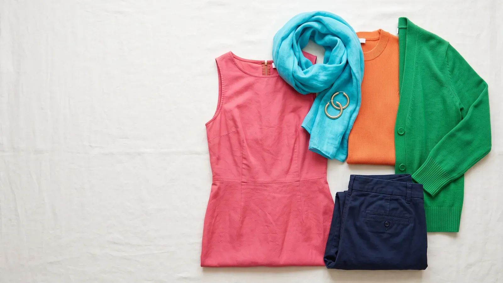
Bright Spring signature colors
- Bright Coral
- Poppy
- Turquoise
- Bright Lime
- Bright Royal Blue
Best neutrals
- Ivory
- Soft White
- Taupe
- Deep Pewter
- Tan
Accents
- Bright Raspberry
- Bright Crimson
- Bright Poppy
- Bright True Red
- Deep Tomato Red
All 60 Bright Spring colors with HEX codes, plus free swatch files
Bright spring is a bold, lively color season. It belongs to the spring family, and people in this season look their most awake in clear, warm colors paired with high contrast.
Its other name is Clear Spring. Brightness is your defining quality, and warmth sits right behind it. So muted, dusty shades usually leave you looking worn out, and crisp, intense colors bring out the clarity in your skin.
Bright Spring color analysis: how to tell
- Dusty rose and muted beige leave your face looking grey and tired
- A poppy red or bright coral shirt makes your eyes light up instantly
- Wearing heavy black close to your face creates dark shadows beneath your eyes
- Dull silver jewelry falls flat, while shiny yellow gold looks natural against your skin
- Saturated, pure colors keep your skin looking clear instead of overwhelming you
Bright Spring (Clear Spring) characteristics: skin, hair and eyes
Skin tone
Bright Spring skin can be fair, medium or deep. What ties it together is how clear it looks next to strong, warm colors. Skin tones you'll commonly see in this season include:
- fair ivory touched with warm peach
- a clear golden beige, the kind that tans easily
- a warm medium bronze that stays clear
- rich espresso or golden brown paired with high contrast
Your undertone is the quiet color that lives just beneath your skin's surface. Yours reads as warm, or neutral leaning warm. High contrast colors flatter your skin far more than muted ones do.
Jewelry in shiny yellow gold usually sits well on your skin. Dull silver, by contrast, tends to fall flat.
Eye color
Eyes in this season often seem to glow, almost glassy. There's typically a crisp, defined line where the iris meets the white of the eye. You might have:
- clear turquoise or aqua, or a bright blue
- bright green, or hazel in a clear topaz
- warm amber, or a golden brown
- a clear dark brown that stands out against the whites of your eyes
Hair that fits this season
Hair here can be anywhere from light to near black, but warmth almost always runs through it. Possibilities include:
- bright golden blonde, or strawberry blonde
- copper red, or a clear auburn
- a medium golden brown warmed with highlights
- deep espresso brown, or a warm black
Why the second name?
Some people call this season Clear Spring. Both names point to the same thing: every shade that flatters you looks fresh and unmuddied, without a trace of gray or brown mixed in.
This site places everyone into one of 12 seasons. Those 12 grow out of 4 families: spring, summer, autumn and winter. Every family contains 3 seasons, and each season takes its name from the trait that defines it. In your case that defining trait is brightness, which certain systems describe as clarity.
Colors that work
Saturated colors suit you best. A saturated color is one at full strength, pure and unclouded, with nothing muted blended in. Shades like these echo the clarity in your skin and eyes, so your face ends up looking lit rather than drained.
This season's signature shades are Bright Coral and Poppy, along with Turquoise, Bright Lime and Bright Royal Blue.
A shirt in bright coral or poppy red can wake up your eyes the moment you put it on. Colors this pure can clarify your skin rather than overwhelm it.
For daily staples, turn to navy first. Deep Cocoa and Soft White are good choices as well. Worn close to your face, they keep your skin glowing rather than shadowed.
The site's complete palette holds 60 named colors, each with its HEX code, arranged under three headings: neutrals, main colors and accents. A list of colors to avoid is included too. Free downloads for this season include a PNG palette card, a CSV listing every HEX code, Adobe ASE swatches, plus a pair of Procreate swatch files. A zip containing all 12 seasons is available as well.
Closest neighbours
Three seasons get mixed up with this one often. Each pairing below comes with a fast check. Put the 2 colors next to your bare face in daylight, then check the mirror.
Bright Winter
- What you share: both seasons shine in saturated, high contrast colors, and both look tired in muted, dusty shades.
- The test: which one makes your skin look clearer, bright coral or bright fuchsia?
- Bright Spring: coral with a warm glow and shiny gold bring your cheeks to life, while fuchsia feels too cold.
- Bright Winter: a cool fuchsia with polished silver really shows off your eyes, while coral turns your skin orange.
Warm Spring
- What you share: both seasons shine in clear, warm shades such as coral and turquoise, worn with yellow gold.
- The test: could you pull off hot pink with crisp black without the outfit wearing you?
- Bright Spring: hot pink and sharp contrast bring your features forward, while golden tan falls flat.
- Warm Spring: black and hot pink look harsh, and you look much better in golden tan and grass green.
Light Spring
- What you share: both seasons carry neutral warm undertones that call for clean, clear colors free of muddy gray.
- The test: which looks more natural on you, soft pastel peach or vivid poppy red?
- Bright Spring: poppy red and bright turquoise really show off your eyes, while pastel peach leaves you looking washed out.
- Light Spring: pastel peach and light aqua keep your face looking fresh, while poppy red hogs the spotlight.
Bright Spring worst colors to skip
Muted shades can drain the life from your face, since they miss the clean brightness your features depend on. The palette flags a few shades to skip: Lilac, Dark Rose, Camel, Mahogany, Teal and Soft Turquoise.
Muted beige and dusty rose can make your face look grey and tired too. You don't have to give them up. Just wear them away from your face, in trousers or shoes, where they won't dull your skin.
- Lilac#BFA0D3
- Dark Rose#8A4456
- Camel#B89061
- Mahogany#742F25
- Teal#00787D
- Soft Turquoise#73BAB5
Bright Spring (Clear Spring) for men
- Suits, coats and trousers
- Ivory
- Soft White
- Taupe
- Deep Pewter
- Shirts and knitwear
- Bright Coral
- Poppy
- Turquoise
- Bright Lime
- Ties, socks and pocket squares
- Bright Raspberry
- Bright Crimson
- Bright Poppy
- Bright True Red
Often confused with Bright Spring
Common questions
Can a bright spring wear black?
Strong black worn near your face can cast dark shadows beneath your eyes. Navy delivers the same crisp, polished effect while keeping your skin bright. Black still works at a distance from your face, in things like trousers or a bag.
Which lipstick shades suit this season best?
Start with clear, warm shades drawn from your signature colors, bright coral or poppy for example. Dusty rose lipsticks usually leave you looking tired, for the same reason muted clothing does.
How much can I trust a bright spring result?
A quiz gives you a starting point. Check it against the mirror tests in daylight, or let a draping session settle the question. During draping, an expert places fabrics of different colors beneath your face to learn which ones flatter you most.
Is a photo required?
Not at all. Cameras on phones and bulbs indoors both distort how skin color reads, so the site relies on questions and mirror checks in daylight. No photo, no account and no email are involved, and your answers stay in your browser.