
Light Spring vs Bright Spring
Light Spring vs Bright Spring comes down to one thing: how much color your face can carry before the color starts wearing you.
The one test that settles it
Which feels more like you: a gentle pastel peach or a bold poppy red?
You're Light Spring if soft peach and pale aqua flatter your face, but a punchy poppy red pulls every eye away from you.
You're Bright Spring if vivid red and clear turquoise make your eyes pop, while delicate pastel peach leaves you looking drained.
Light Spring and Bright Spring side by side
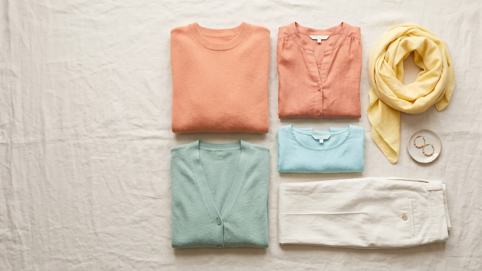
Light Spring
Signature colors
- Bright Peach
- Butter Yellow
- Light Coral
- Light Aqua
- Soft Apple Green
Skip
- Black#000000
- Navy#172A5A
- Dark Magenta#690053
- Emerald#008753
- Dark Cognac#4A2100

Bright Spring
Signature colors
- Bright Coral
- Poppy
- Turquoise
- Bright Lime
- Bright Royal Blue
Skip
- Lilac#BFA0D3
- Dark Rose#8A4456
- Camel#B89061
- Mahogany#742F25
- Teal#00787D
- Soft Turquoise#73BAB5
The two seasons both carry warm neutral undertones and look best in crisp, pure shades without any muddying gray.
You may also see Bright Spring called Clear Spring. It's the same season.
- What settles it: depth. Light Spring runs light, Bright Spring runs medium
- What they share: a neutral undertone that leans warm
- Best neutral for Light Spring: ivory
- Best neutral for Bright Spring: navy
Both seasons live in the spring family, and both look best in clean, clear colors with no muddy gray in them. Light Spring suits gentle pastels. Bright Spring can carry stronger, more vivid colors.
The one trait that separates them
Both seasons are warm and clear, so the real difference is how light or deep your features are overall. Depth describes the overall lightness or darkness of your hair, skin and eyes taken together. Light Spring features are light, while Bright Spring features land at a medium depth.
Depth decides how much color your face can hold. Light Spring is a light, warm palette of fresh pastels with a soft sunny glow. Bright Spring is a clear, vivid palette made for people whose features need pure, warm, high-contrast colors to look awake.
A daylight mirror check you can do at home
You're answering one question: which one looks more natural on you, soft pastel peach or vivid poppy red? A phone camera and indoor bulbs both shift how skin looks, so a mirror in daylight tells you more than any selfie.
- Stand close to a window during the day, so daylight falls on your face as it naturally would.
- Pull your hair back so its color doesn't change how the fabric looks against your skin.
- Put a pastel peach top or piece of fabric beneath your chin and study your face, not the fabric.
- Swap in a vivid poppy red piece and study your face once more.
- Try light gold next to shiny yellow gold jewelry, and ivory next to navy, to check that your answer stays the same.
What to look for in the mirror
Let your skin be the guide, not the color. A shade that suits you evens out your skin and doesn't deepen the shadows beneath your eyes. One that doesn't suit you adds a gray tint or drains your face.
A color that's too strong means people notice the shirt before they notice you. One that's too soft drains the life from your face.
How to tell you're a Light Spring
Pastel peach and light aqua leave your face fresh and glowing, while vivid poppy red pulls every eye to itself. The shades that define this season are butter yellow, bright peach, soft coral, pale aqua and a gentle green.
- Black worn close to your face leaves you tired and faded.
- Peach and coral shades wake up your face instantly.
- Light gold and rose gold jewelry sit softly against your skin.
- Dark lipstick dominates your face, so your mouth is all anyone notices.
- Pure white feels harsh compared with soft cream or ivory.
Light Spring skips navy, black, dark magenta, emerald and dark cognac.
How to tell you're a Bright Spring
Vivid poppy red and bright turquoise light up your eyes, while pastel peach drains the color from your face. The shades that define this season are bright coral, poppy, turquoise, bright lime and bright royal blue.
- Dusty rose and muted beige leave your face gray and tired.
- A shirt in bright coral or poppy red brings your eyes to life instantly.
- Heavy black near your face creates dark shadows beneath your eyes.
- Shiny yellow gold jewelry looks right on your skin, while dull silver falls flat.
- Clean, fully saturated shades leave your skin looking fresh and even, never overwhelmed.
The colors Bright Spring avoids: camel, lilac, dark rose, mahogany, teal and soft turquoise.
Comparing the two springs
| Light Spring | Bright Spring | |
|---|---|---|
| Depth of features | Light | Medium |
| Clarity of color | Bright | Bright |
| Temperature of undertone | Neutral with a warm lean | Neutral with a warm lean |
| Metal | Light gold and rose gold | Bright yellow gold |
| Go-to neutral | Ivory | Navy |
| Wearing black | Leaves you faded | Adds shadows under your eyes |
What do both springs have in common?
Both seasons run neutral warm. Your undertone is the tint showing through your skin, and in both cases it leans golden rather than cool. Both also carry bright clarity. Clarity is the measure of a color's purity, and both palettes need clean, clear shades with no muddy gray.
Black near the face is hard for both seasons. On Light Spring it drags the whole look down, and on Bright Spring it deepens the shadows around the eyes.
Still torn between the two
Try again in daylight on another day. Compare pastel peach with poppy red first, then ivory with navy, holding each color beneath your chin in turn. Navy can help you decide: it's Bright Spring's best neutral, but Light Spring is better off leaving it out.
A quiz is a starting point. A draping session with a trained person, or more mirror checks in daylight, will confirm which spring you are. Draping is when a trained person holds colored fabrics beneath your chin and compares them.
Questions people often ask
Do brown eyes rule out Light Spring?
Your season comes from the full picture built on 3 traits: temperature, depth and clarity. Eyes alone don't settle it. If your hair, skin and eyes look light together and pastels suit you, the daylight test can tell you whether Light Spring fits.
Borrowing colors from the other spring palette
Warmth and clarity run through both palettes, yet each keeps its own list of colors to avoid. Check that a shade you want to borrow isn't on your own skip list first. Navy is a good example: Bright Spring wears it well, but Light Spring skips it.
Getting the full palette for each spring
Every season palette on the site lists 60 named colors with HEX codes, split into neutrals, main shades, accents and a list of colors to skip. You can download each palette for free in several formats: a PNG card, a CSV file, Adobe ASE swatches or Procreate swatches.