
Light Spring color palette
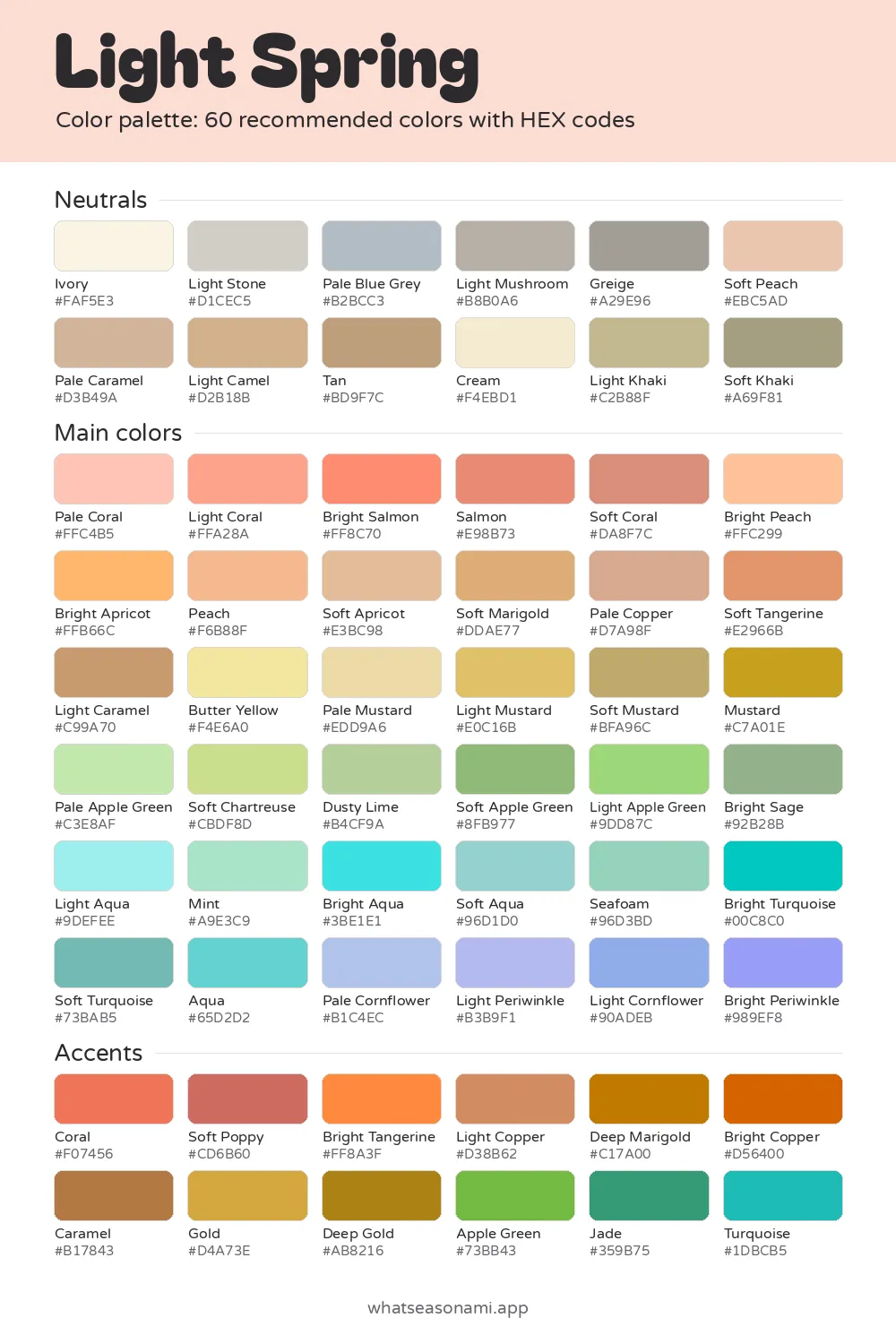
The Light Spring color palette holds 60 fresh pastels that are light and warm, with a gentle, sunny brightness.
Light Spring neutrals
- Ivory
- Cream
- Soft Peach
- Light Stone
- Pale Blue Grey
- Pale Caramel
- Light Mushroom
- Light Camel
- Light Khaki
- Tan
- Greige
- Soft Khaki
Light Spring main colors
Reds and pinks
- Pale Coral
- Light Coral
- Bright Salmon
- Salmon
- Soft Coral
Oranges and browns
- Bright Peach
- Pale Mustard
- Peach
- Soft Apricot
- Bright Apricot
- Pale Copper
- Soft Marigold
- Soft Tangerine
- Light Mustard
- Light Caramel
- Soft Mustard
Golds and olives
- Butter Yellow
- Mustard
Greens
- Pale Apple Green
- Mint
- Soft Chartreuse
- Dusty Lime
- Seafoam
- Light Apple Green
- Bright Sage
- Soft Apple Green
Blues and teals
- Light Periwinkle
- Pale Cornflower
- Bright Periwinkle
- Light Aqua
- Light Cornflower
- Soft Aqua
- Aqua
- Soft Turquoise
- Bright Aqua
- Bright Turquoise
Light Spring accent colors
- Soft Poppy
- Coral
- Light Copper
- Bright Tangerine
- Bright Copper
- Caramel
- Deep Marigold
- Gold
- Deep Gold
- Apple Green
- Jade
- Turquoise
Free files: palette card (WebP), HEX list (CSV), Adobe swatches (ASE), Procreate part 1, Procreate part 2. Tap any HEX code to copy it.
Colors to avoid as a Light Spring
- Navy#172A5A
- Deep Poppy#BA0C11
- Emerald#008753
- Black#000000
- Moss#647C36
- Dark Magenta#690053
- Bright Terracotta#D35725
- Dark Cognac#4A2100
It fits you when your coloring is light and warm across skin, hair and eyes, and the three sit close together in depth.
- Temperature: warm with a neutral bend
- Depth: on the light side
- Clarity: bright and clean
- Best neutral: Ivory
- Metals: light gold, rose gold
Inside the Light Spring palette
Each shade here stays light and warm rather than cool. It's clear too, not dusty. Clarity describes how clean or muted a color appears, and your colors sit on the clean, fresh end of that scale. That's what keeps the palette pastel but never faded.
The 60 shades divide into neutrals (12), main colors (36) and accents (12). Every swatch below shows its HEX code, and tapping a code copies it.
These signature colors say the most about your season:
- Bright Peach
- Butter Yellow
- Light Coral
- Light Aqua
- Soft Apple Green
Is this season right for you?
Your skin carries a warm peachy or golden undertone. An undertone is the color underneath your skin's surface. Your skin also sits close in depth to your hair and eyes, with very little contrast between them. In this case, contrast means how far apart your features are in lightness or darkness.
Skin, hair and eyes usually show up something like this:
| Feature | Typical appearance |
|---|---|
| Skin | Fair ivory with a hint of peachy pink; light beige warmed by golden undertones; a light-to-medium tan with sunny golden warmth; warm porcelain skin with light golden freckles |
| Hair | Light golden blonde; strawberry blonde; light brown with warm golden highlights; a light copper red |
| Eyes | Clear light blue; warm aqua or blue-green; light hazel flecked with gold; a clear, light amber brown |
Your eyes tend to look glass-clear, often with a warm golden or sunny ring near the pupil.
Daily life backs this up. Peach and coral shades wake your face up at once. Black worn near your face leaves you looking tired and washed out. Pure white feels too sharp next to your skin, while soft cream or ivory flatters it.
Wearing Light Spring neutrals every day
Neutrals step in for the black, white, navy and grey most wardrobes rely on. Yours are softer and warmer, so your face stays fresh under them rather than weighed down.
Ivory is your strongest neutral, and Cream behaves the same way. Wear them in place of stark white or black. When it comes to trousers, coats and bags, let Light Camel and Pale Blue Grey do the work of dark brown and grey.
The rest of the neutrals widen your options:
- Light Stone, Light Mushroom and Greige when you want basics that stay soft and quiet
- Soft Peach tops to warm up the area around your face
- Pale Caramel and Tan on warmer items: think shoes, belts and the like
- Khaki, in both its light and soft forms, on casual trousers and jackets
How to choose main colors and accents
Main colors are shades that suit bigger garments: shirts, dresses, knitwear and similar. The range covers coral and peach, apricot, soft yellow and mustard, fresh green, aqua and turquoise, plus lighter blues such as Pale Cornflower and Light Periwinkle. Starting with the signature colors is the simplest approach.
The accents are the palette's most intense shades. Coral, Soft Poppy and Bright Tangerine sit on the warm side; Light Copper, Deep Marigold and Bright Copper follow; then Caramel, Gold, Deep Gold, Apple Green, Jade and Turquoise round it out. Since your coloring is light, they usually work best in small doses: a scarf, a bag, or shoes worn against neutral pieces.
Jewelry in light gold or rose gold rests gently against your skin.
Which colors should you skip?
On your skip list you'll find Black, along with Navy, Dark Magenta, Emerald and Dark Cognac. Next to light, warm, clear coloring like yours, these shades look dark and heavy, so people notice the clothes before your face.
Black shows this most clearly, since it can leave you looking washed out and tired. Makeup works by the same logic. Dark lipstick dominates, so people notice your mouth and nothing else.
Using your phone to shop in daylight
Both phone cameras and indoor bulbs shift color, so a store's lighting can push a garment's apparent temperature either direction.
- Before heading out, save the palette card to your phone with the free PNG download.
- Carry the garment to a window or outdoors and look at it in daylight.
- Place your phone screen beside the fabric and match it to the nearest swatch.
- Hold the color under your chin and look at yourself in a mirror. A shade that's clear and sunny ought to lift your face, not drain it.
Questions people often ask
What sets this season apart from Light Summer?
Light Summer sits in the summer family; Light Spring in the spring family. Both names come from being light, but Light Spring's second quality is warmth. Each season has its own 60 colors, so the palettes aren't interchangeable.
What if my job requires a dark suit?
Both navy and black appear on your skip list. If you get any say in the matter, your deepest neutrals are Tan, Soft Khaki and Light Khaki. Pair them with an Ivory or Cream shirt so the lighter color is the one next to your skin.
Which hair dye colors work well with this coloring?
Hair that's naturally Light Spring runs toward golden blonde on the lighter end, strawberry blonde, light brown warmed with golden streaks, or a copper red kept light. Staying near those shades keeps the gentle, low-contrast look that works for you, and a free hair color test on the site can help you pin down your shade.
Do these colors work for design or digital art?
They do. Every palette comes as a free download in several formats: a PNG card, a CSV of HEX codes, Adobe ASE swatches, plus Procreate swatches split across 2 files. A zip bundling every one of the 12 seasons is available too.
Can you trust a quiz result on its own?
A quiz is only a first step. Trying shades on in daylight with a mirror, or an in-person draping session, can confirm that Light Spring is your season.