
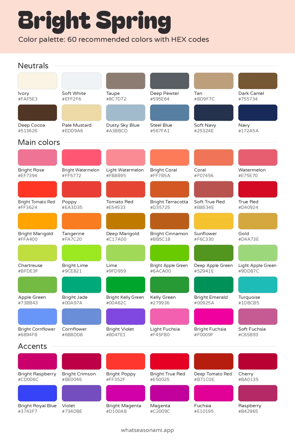
Bright Spring color palette
This bright spring color palette holds 60 clean, warm shades made for people whose skin, hair and eyes have strong contrast between them.
Bright Spring neutrals
- Soft White
- Ivory
- Pale Mustard
- Dusty Sky Blue
- Tan
- Taupe
- Steel Blue
- Deep Pewter
- Dark Camel
- Deep Cocoa
- Soft Navy
- Navy
Bright Spring main colors
Reds and pinks
- Light Watermelon
- Bright Rose
- Bright Coral
- Bright Watermelon
- Coral
- Watermelon
- Bright Tomato Red
- Poppy
- Tomato Red
- Soft True Red
- True Red
Oranges and browns
- Sunflower
- Tangerine
- Gold
- Bright Marigold
- Bright Terracotta
- Bright Cinnamon
- Deep Marigold
Greens
- Light Apple Green
- Lime
- Chartreuse
- Bright Lime
- Apple Green
- Bright Apple Green
- Kelly Green
- Deep Apple Green
- Bright Jade
- Bright Kelly Green
- Bright Emerald
Blues and teals
- Bright Cornflower
- Cornflower
- Turquoise
Purples and berries
- Light Fuchsia
- Bright Violet
- Soft Fuchsia
- Bright Fuchsia
Bright Spring accent colors
- Raspberry
- Bright Crimson
- Cherry
- Bright True Red
- Bright Poppy
- Deep Tomato Red
- Bright Royal Blue
- Violet
- Magenta
- Bright Magenta
- Fuchsia
- Bright Raspberry
Free files: palette card (WebP), HEX list (CSV), Adobe swatches (ASE), Procreate part 1, Procreate part 2. Tap any HEX code to copy it.
Colors to avoid as a Bright Spring
- Teal#00787D
- Lilac#BFA0D3
- Dark Rose#8A4456
- Soft Turquoise#73BAB5
- Camel#B89061
- Bright Pine#00593E
- Mahogany#742F25
- Light Jade#6CB697
You may also see it under the name Clear Spring.
- Season: Bright Spring, which some people call Clear Spring
- Shades on the list: 60 in total, spread across neutrals, main colors and accent shades
- Best deep neutral: Navy
- Best metal: Shiny yellow gold
The name Clear Spring
Bright Spring also goes by the name Clear Spring. The season is identical, and so are the 60 colors. The word clear describes the key quality here: colors that stay pure and vivid, with none of that gray mixed through them.
Bright Spring belongs to the spring group, one of four seasonal groups covered on this site. Spring breaks into three seasons, each named for its strongest trait. Here that trait is brightness.
Bright spring palette
Three things are true of every shade in this palette. First, they're warm, with a sunny undertone. Second, they sit in the middle for depth, never washed out and never heavy. Third, they're clear, so you get pure, saturated color rather than anything dusty.
Your skin might read clear, warm, or somewhere between warm and neutral, meaning there's a golden or peach tone just beneath the surface. These shades sit best against features that contrast strongly. Muted or dusty colors, on the other hand, can leave your face looking grey and worn.
The 60 colors split like this:
- Neutrals: 12 shades that suit outerwear, trousers, shirts and bags
- Main colors: shades that suit tops, dresses and anything worn close to the face
- Accents: 12 shades that suit scarves, bags and lipstick
The signature shades here are Bright Coral, Poppy, Turquoise, Bright Lime, plus Bright Royal Blue. One bright coral or poppy red top is often enough to make your eyes pop.
Bright spring neutrals
Navy is the dark neutral that works hardest for you. It keeps an outfit crisp without pulling color away from your face. Black can cast dark shadows under your eyes, and Soft Navy and Deep Cocoa are gentler swaps.
Skip stark white in favor of Soft White or Ivory. Both keep your skin glowing rather than chalky.
For daily wear, you also have Taupe, Tan, Dark Camel and Deep Pewter to lean on. When you want variety, Dusty Sky Blue, Steel Blue and Pale Mustard step in nicely. Plain Camel isn't in your palette, so reach for Dark Camel when you want that look.
Choosing main colors and accents
Keep the main colors where they flatter you most: tops, dresses and scarves worn near the face. Start with Bright Coral or Poppy, then reach for Turquoise, Sunflower, Gold, Bright Lime or any of the apple greens.
Accents work best in small doses. A Navy jacket looks sharp paired with Bright Royal Blue, Cherry, Bright Magenta, Violet or Fuchsia. If a whole outfit in brights feels like too much, keep one accent and ground it with a quiet neutral.
Colors to skip
These six shades don't do your coloring any favors: Lilac and Dark Rose, Camel and Mahogany, plus Teal and Soft Turquoise.
The first two on that list carry a cool, smoky tint that pulls warmth right out of your cheeks. Camel and Mahogany sit too heavy. Teal and Soft Turquoise are dustier versions of the Turquoise and Bright Jade you already own, so your eyes can lose their sparkle.
Checking a color before you buy
Shop lighting often adds a yellow or blue tint to fabric, so a quick look in daylight tells you more.
- Pull up your palette on your phone and push the screen brightness to full.
- Carry the garment to a window or step outside, letting daylight fall across the cloth.
- Lay the phone right against the fabric and compare. Does the color hold its clarity and warmth against the swatch?
- Stand in front of a mirror with the cloth near your chin and see whether your face keeps its brightness.
Screens and indoor bulbs both shift color, so think of this as a guide rather than a rule.
Quick answers
Do Clear Spring and Bright Spring describe the same season?
It is the same season either way. Both names cover one season and its 60 colors, so any swatch you find works whichever label it carries.
Is black fine away from my face?
Yes, with care. Black causes trouble mainly beside your face, where it tends to shadow the area under your eyes. Lower down, in trousers, shoes or a bag, it's less of an issue. Still, Navy is the smarter pick when you want something dark and simple.
What metal should my jewelry be?
Gold with a bright, yellow shine suits you naturally. Dull silver can fall flat.
Do hair or eye color affect my swatches?
The palette holds steady either way. Bright Spring hair runs from golden blonde and copper red all the way to deep espresso, and eyes can be anything from turquoise to a clear, deep brown. What they have in common is sharp, clean contrast, and that's what keeps the palette the same. A quiz is only a starting point; checking yourself in a mirror by daylight, or having someone drape colors on you in person, will confirm it.