
Warm Spring vs Bright Spring
When you compare Warm Spring vs Bright Spring, notice which matters more near your face: golden warmth or vivid color and contrast.
The one test that settles it
Can you pull off crisp black and hot pink, or would the outfit overwhelm you?
You're Warm Spring if grass green and golden tan make you look way better, since black and hot pink read as harsh on you.
You're Bright Spring if sharp contrast and hot pink make your features pop while golden tan comes across as too dull.
Warm Spring and Bright Spring side by side
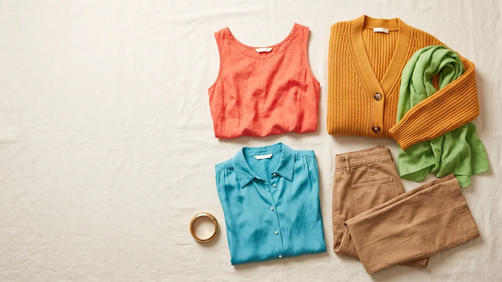
Warm Spring
Signature colors
- Coral
- Bright Marigold
- Apple Green
- Bright Turquoise
- Poppy
Skip
- Black#000000
- Rose#D5778E
- Bright Cobalt#1946E9
- Lilac#BFA0D3
- Dark Rose#8A4456
- Teal#00787D
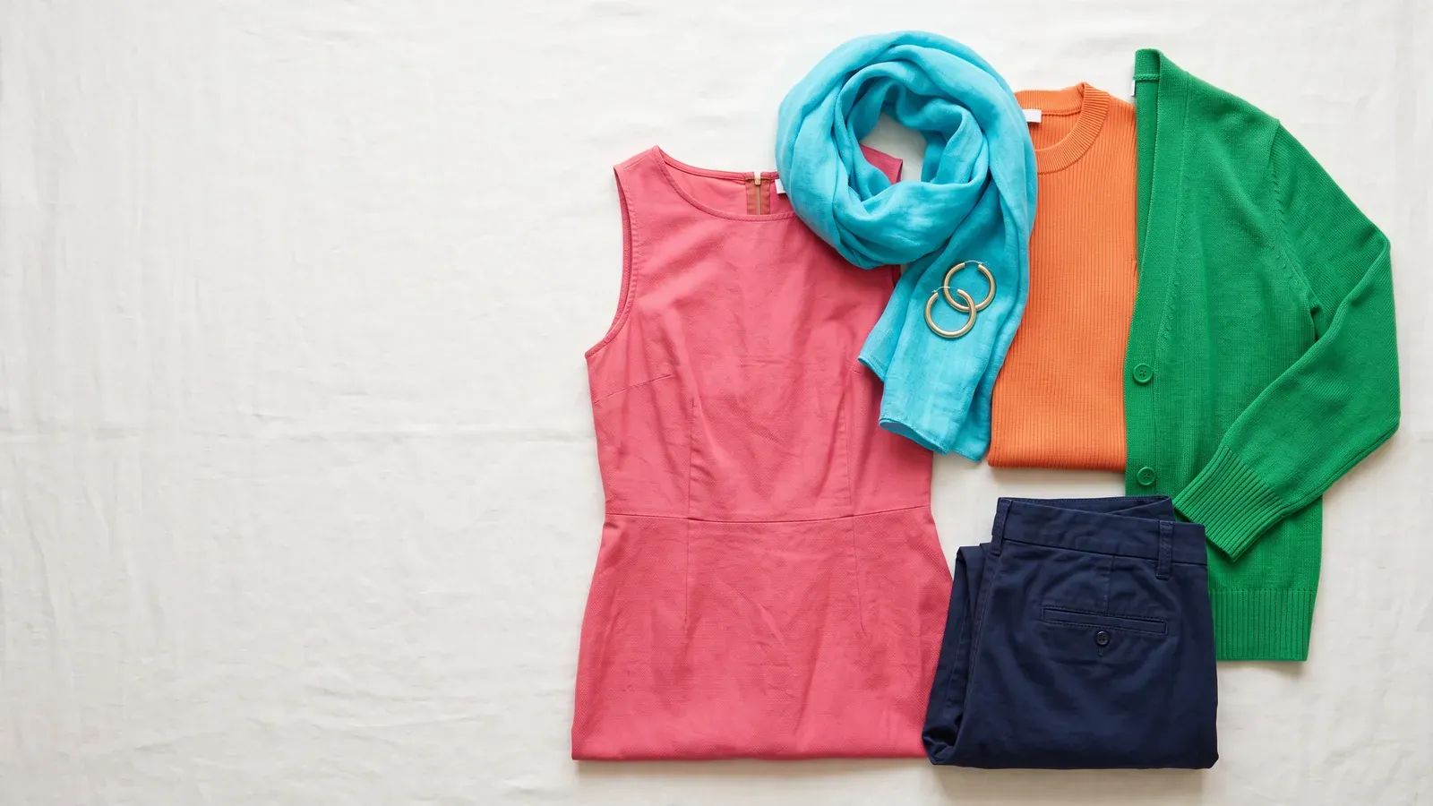
Bright Spring
Signature colors
- Bright Coral
- Poppy
- Turquoise
- Bright Lime
- Bright Royal Blue
Skip
- Lilac#BFA0D3
- Dark Rose#8A4456
- Camel#B89061
- Mahogany#742F25
- Teal#00787D
- Soft Turquoise#73BAB5
Both seasons shine in clear, warm shades such as coral and turquoise, paired with yellow gold.
Both palettes are fresh and sunny, and both sit at medium depth. Warm Spring puts warmth before everything else. Bright Spring puts brightness first.
- The deciding question: can hot pink and crisp black sit near your face without overpowering you?
- Warm Spring: golden tan and grass green shades suit you far better than stark black or hot pink
- Bright Spring: hot pink and sharp contrast make your features stand out, while golden tan looks dull.
- Both seasons shine in the same metal: yellow gold
What sets the two apart?
Warm and bright describe both seasons. What changes is which one your face depends on.
Every color in the Warm Spring palette starts from a clear golden yellow, with no cool undertones anywhere. Warmth leads here, and brightness comes second.
Bright Spring is clean and vivid, made for people whose features look most awake in pure, warm color worn with high contrast. Clarity, meaning how pure and saturated a color is instead of soft or dusty, leads the way. Warmth follows, and the temperature runs neutral with a warm lean.
| Warm Spring | Bright Spring | |
|---|---|---|
| Dominant trait | Warmth first | Brightness first |
| Temperature | Golden warm | Warm-leaning neutral |
| Depth | Medium | Medium |
| Flattering metal | Yellow gold, brass | Shiny yellow gold |
| Go-to neutral | Camel | Navy |
| Star shades | Coral and bright marigold, plus apple green, bright turquoise and poppy | Bright coral with poppy, alongside turquoise, bright lime and bright royal blue |
| Shades to pass on | Black and rose, also bright cobalt, lilac, dark rose and teal | Lilac, dark rose, camel and mahogany, along with teal and soft turquoise |
Camel deserves a second look. One season calls it its best neutral and the other tells you to skip it, which makes it a handy shade to test with.
Other names you might see
Both of these labels point to the same pair of seasons. True Spring is simply another way of saying Warm Spring, and Clear Spring another way of saying Bright Spring. People use all four names, and the guidance for each matching pair is identical.
Running the test at home in daylight
A phone camera and indoor lighting both change how skin looks, so a mirror by a window beats a selfie.
- Stand near a window in daylight with the light falling evenly across your face.
- Drape a golden tan or grass green top beneath your chin and study your face in the mirror.
- Trade it for a hot pink or black top and take another look.
- Put a camel top next to a navy one, since each season claims one as its best neutral.
- If you own any jewelry, hold yellow gold and then silver near your face.
Watch your skin, not the clothes. The right color evens your skin out. The wrong one darkens the area under your eyes or drags a gray tone across your face.
How to tell you're a Warm Spring
- Black near your face turns your skin sallow and deepens the hollows beneath your eyes.
- Yellow gold jewelry sits naturally against your skin and adds warmth, while silver reads as cold and sits apart from you.
- Warm coral or peach lipstick wakes up your whole face with barely any eye makeup.
- Icy pastel pinks, or lavender with cool undertones, drain your lips until they look pale.
- Rich camel and warm cream bring out your eyes better than stark white ever will.
How to tell you're a Bright Spring
- Muted beige and dusty rose leave your face looking gray and worn out.
- One bright coral or poppy red shirt and your eyes suddenly pop.
- Heavy black near your face deepens the hollows beneath your eyes.
- Shiny yellow gold jewelry feels like it belongs on your skin, while dull silver goes flat.
- Pure, saturated colors keep your skin clear without stealing the show.
Contrast plays a part in this season too. It's the gap between the light and dark colors you wear, hot pink beside navy for instance. Bright Spring needs high contrast to look awake, and the same contrast turns harsh on Warm Spring.
What the 2 palettes share
Both seasons shine in clear, warm color such as coral and turquoise, worn with yellow gold. Poppy appears as a signature shade in each palette. They also share three colors to skip: lilac, dark rose and teal. Black is a skip for Warm Spring, though heavy black near the face can cast shadows on Bright Spring too.
Stuck between the two
While you're deciding, the colors both palettes love are a safe starting point. Coral, poppy and turquoise with yellow gold work for either one.
Try camel beside navy, too. Camel is Warm Spring's best neutral but a shade Bright Spring is told to skip; navy is Bright Spring's best neutral. Hold both up in daylight and see which one makes your skin look even.
A quiz can only take you so far. Checking yourself in a mirror in daylight, or having fabric swatches draped on you in person, can confirm your season. Draping is when a trained person places a set of colored fabrics under your chin and compares how your face responds to each.
Common questions
Which lipsticks help me tell the 2 palettes apart?
For Warm Spring, reach for warm coral or peach, since it can light up your whole face with very little eye makeup. Bright Spring lists Bright Coral and Poppy among its signature shades, so a vivid poppy lip is what you compare against that peach.
Which metal should I wear if I'm still unsure?
Yellow gold flatters both seasons. Warm Spring can pull off brass as well. Bright Spring looks best in shiny yellow gold, so a bright, polished gold is a good choice while you're still deciding.
Is a photo upload needed to find my season?
No. The quiz walks you through 3 questions, one at a time: gold versus silver, light, medium or deep features, and whether bright or soft colors flatter you most near your face. Nothing gets uploaded, and there's no camera, email or account. Your answers never leave your browser.
How big is each palette?
Every season comes with 60 named colors and their HEX codes, grouped into neutrals, main colors and accent shades, alongside a list of shades to avoid. Each one downloads for free in several formats: a PNG palette card, a CSV of HEX codes, Adobe ASE swatches or Procreate swatches.