
Deep Autumn color palette
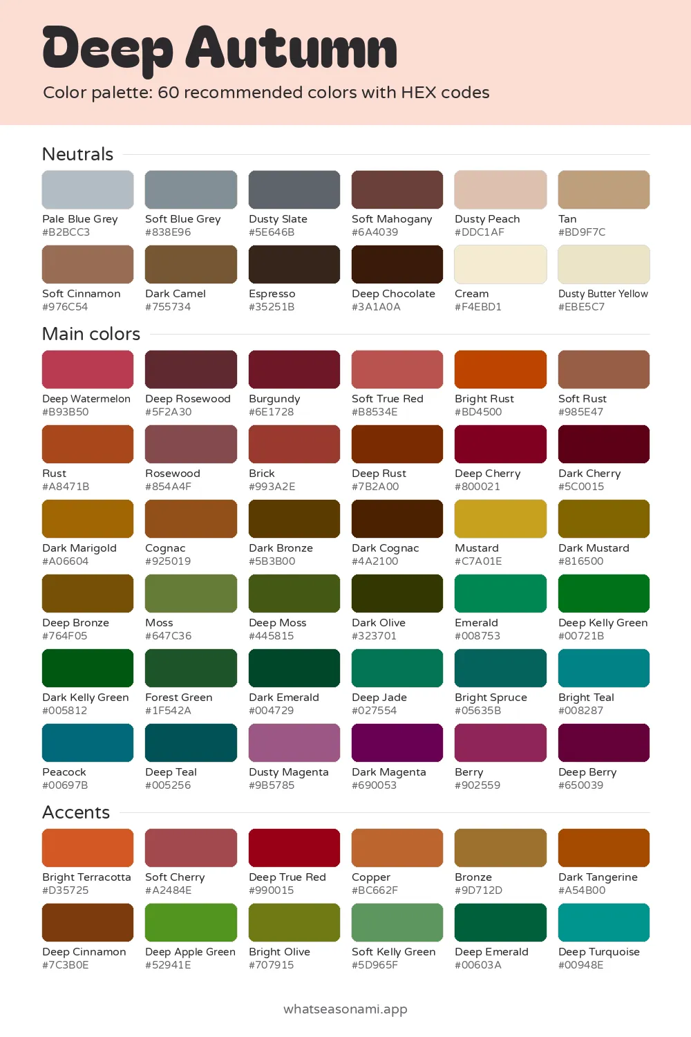
The deep autumn color palette gathers 60 warm, rich, earthy shades made for people with dark hair, dark eyes and warm skin.
Deep Autumn neutrals
- Cream
- Dusty Butter Yellow
- Dusty Peach
- Pale Blue Grey
- Tan
- Soft Blue Grey
- Soft Cinnamon
- Dusty Slate
- Dark Camel
- Soft Mahogany
- Espresso
- Deep Chocolate
Deep Autumn main colors
Reds and pinks
- Soft True Red
- Deep Watermelon
- Rosewood
- Brick
- Berry
- Deep Rosewood
- Burgundy
- Deep Cherry
- Dark Cherry
Oranges and browns
- Soft Rust
- Rust
- Bright Rust
- Cognac
- Dark Marigold
- Deep Rust
- Deep Bronze
- Dark Bronze
- Dark Cognac
Golds and olives
- Mustard
- Dark Mustard
- Dark Olive
Greens
- Moss
- Emerald
- Deep Jade
- Forest Green
- Deep Kelly Green
- Deep Moss
- Dark Kelly Green
- Dark Emerald
Blues and teals
- Bright Teal
- Peacock
- Bright Spruce
- Deep Teal
Purples and berries
- Dusty Magenta
- Dark Magenta
- Deep Berry
Deep Autumn accent colors
- Deep True Red
- Soft Cherry
- Bright Terracotta
- Copper
- Deep Cinnamon
- Dark Tangerine
- Bronze
- Bright Olive
- Deep Apple Green
- Soft Kelly Green
- Deep Emerald
- Deep Turquoise
Free files: palette card (WebP), HEX list (CSV), Adobe swatches (ASE), Procreate part 1, Procreate part 2. Tap any HEX code to copy it.
Colors to avoid as a Deep Autumn
- Mint#A9E3C9
- Rose#D5778E
- Cornflower#6B8DD8
- Bright Blush#FFC7CA
- Black#000000
- Pale Turquoise#ADE8E3
- Magenta#C2009C
- Bright Cobalt#1946E9
Deep Autumn sits at the dark end of the warm seasons, and you may also hear it under its other name.
- Goes by: Dark Autumn
- Shades in the set: 60, split into neutrals, mains and accents
- Top neutral: Espresso
- Top metals: antique gold and bronze
What ties these shades together
Depth comes first in every shade here, warmth comes second. Depth means the colors are dark and weighty enough to sit well with your dark hair and eyes. Warmth means they lean gold, not blue. Your skin carries a warm golden or neutral olive undertone, the faint tint that sits just under the surface. Because of that undertone, your dark hair and eyes create strong contrast.
On the clarity scale, these colors land in the middle. Clarity describes whether a color looks bright or muted. Deep Autumn shades never go neon, but they're not heavily greyed and dusty either. They feel full and rich, the way rust, olive and dark mustard do.
If you want the season in a few words, Burgundy, Deep Rust, Dark Mustard, Forest Green and Deep Teal say it best.
How to tell this palette is yours
Most people in this season notice some of this when they look in the mirror:
- Pure black feels a little hard on you, but dark chocolate brown is gentler on your skin.
- Icy pastels such as baby pink or mint leave your face looking dull and drained.
- Antique gold and bronze pieces melt into your skin, while bright silver just sits there.
- Rich terracotta, rust and olive green wake up your eyes and balance your skin tone.
- Stark white drains you, while cream sits naturally beside your face.
Your skin may fall anywhere from warm ivory or beige with golden undertones, to warm olive that tans easily, to medium golden brown or bronze, to deep rich brown carrying warm red or golden undertones. Hair often runs in medium-to-dark golden browns, deep chestnut shot with red or copper, dark chocolate or espresso browns, or warm black. For eyes, expect dark warm brown, deep hazel flecked with gold or green, dark olive or forest green, or a brown so deep it can pass for black. Golden, amber or olive flecks and patterns often come out in the light.
The Deep Autumn neutral shades
These base colors carry your bigger pieces, think coats, trousers and bags. Swap hard black out for Espresso or Deep Chocolate, and put Cream where stark white used to be. For grey, Dusty Slate is dark enough to hold its own against your coloring. For tan, Dark Camel fills the same role.
Espresso is the workhorse of the group, so it's a smart first pick for a coat or trousers you'll reach for again and again.
Here's the whole set of 12:
- Espresso
- Pale Blue Grey
- Deep Chocolate
- Soft Blue Grey
- Cream
- Dusty Slate
- Dusty Butter Yellow
- Soft Mahogany
- Dusty Peach
- Tan
- Soft Cinnamon
- Dark Camel
Choosing your main colors
All of the main colors work in tops, dresses and knitwear worn close to your face. They group into families, so a good way in is to start from a color you already like wearing:
- Reds and pinks: Burgundy, Deep Rosewood, Deep Watermelon, Rosewood, Soft True Red, Dark Cherry, Deep Cherry
- Rusts and browns: Deep Rust, Cognac, Bright Rust, Brick, Rust, Soft Rust, Dark Cognac
- Golds and bronzes: Dark Mustard, Dark Bronze, Dark Marigold, Mustard, Deep Bronze
- Greens: Forest Green, Deep Moss, Dark Olive, Moss, Deep Jade, Dark Kelly Green, Emerald, Dark Kelly Green, Dark Emerald
- Teals: Deep Teal, Bright Spruce, Peacock, Bright Teal
- Berries: Deep Berry, Dark Magenta, Berry, Dusty Magenta
If blue is your favorite, the teals are as close as this palette gets, and Peacock or Deep Teal can stand in for it.
Wearing the accent colors
The 12 accents count as the palette's strongest shades. They shine in small doses, like scarves, bags, lipsticks or prints. The full list is Deep True Red, Bright Terracotta, Copper, Bronze, Soft Cherry, Dark Tangerine, Deep Cinnamon, Deep Apple Green, Bright Olive, Soft Kelly Green, Deep Emerald and Deep Turquoise.
Here's an easy way to put an outfit together:
- Begin with a neutral such as Espresso or Deep Chocolate for your biggest pieces, so the outfit starts calm.
- Bring a main color like Deep Cherry, Cognac or Dark Mustard close to your face to lift your skin.
- End with a single accent like Bright Terracotta or Copper on something small: enough to be interesting, never overwhelming.
Shades Deep Autumn should skip
This palette flags six shades to leave out: Black, Bright Blush, Mint, Pale Turquoise, Magenta and Cornflower. Black reads harsher than your deepest shades, so Espresso and Deep Chocolate step in for it. Mint, Bright Blush and Pale Turquoise come across light and icy; pale shades in that family can leave your face looking sallow and tired. Cornflower and Magenta pull toward the cool side, so rather than blending with your warm skin they stand apart from it.
Taking your palette out shopping
Both phone cameras and indoor bulbs distort how colors look, so daylight is the most honest test. Bring the garment to a window or step outside and compare it with the matching swatch on your phone. If the warmth and depth look close, the piece will probably work. When a red starts looking cool and pink under daylight, a warmer pick such as Brick or Rust usually suits you better.
The free files for this season let you keep the colors handy while you shop. The download includes a palette card in PNG form, a CSV file of HEX codes, Adobe ASE swatches and 2 Procreate swatch files. A HEX code is six characters that tell a screen or design app exactly which color to show; tap one and it's copied for you.
Think you might be a Deep Autumn?
The at-home quiz walks you through 3 quick questions: does gold or silver suit you better, are your features light, medium or deep, and do bright or soft colors look better near your face? From there it picks 1 of the 12 seasons for you and points you toward that palette. Nothing is uploaded, and no photo, email or account is needed, since your answers stay in your browser.
Treat the quiz as a first step. You can confirm the result by holding colors up to your face in a mirror in daylight, or through an in-person draping session. The site also gives away free quizzes for undertone, skin tone, hair shade and the gold-versus-silver question.
Questions people often ask
Is black okay with dark autumn neutrals?
Black is one of the shades this season leaves out, and Espresso and Deep Chocolate stand in for it. You still get that same dark, grounding effect, only these shades soften your skin instead of fighting it.
Which jewelry metals suit this season best?
For Deep Autumn, antique gold and bronze come out on top. Both sink gently into your skin, while bright silver tends to rest on the surface of it. The palette's Copper and Bronze accents make a natural pairing with these metals.
Should I toss every color that isn't on my list?
No, there's no need. Think of the palette as a guide for picking what suits you best, especially close to your face. Colors that aren't on the list can still be worn, and plenty of people just use the palette when buying something new.
How can an autumn season carry blues and greens?
Deep Autumn sits at neutral-warm on the temperature scale rather than fully warm, so it can handle some greens and blues that lean teal. Deep Teal, Peacock, Deep Jade and Emerald all carry enough depth and richness to match your dark features.
Is Dark Autumn the same as Deep Autumn?
Yes, both names point to the same season. It sits in the autumn family, which divides into 3 seasons, and this one takes its name from its strongest trait, depth.