
Cool Summer color palette
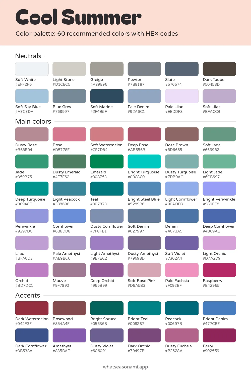
This cool summer color palette brings together 60 gentle blues, roses, plums and cool greens, all in a medium depth and none of them warm.
Cool Summer neutrals
- Soft White
- Pale Lilac
- Light Stone
- Soft Sky Blue
- Soft Lilac
- Pale Denim
- Greige
- Blue Grey
- Pewter
- Slate
- Soft Marine
- Dark Taupe
Cool Summer main colors
Reds and pinks
- Pale Fuchsia
- Soft Rose Pink
- Rose
- Soft Watermelon
- Dusty Rose
- Deep Rose
- Rose Brown
- Raspberry
Greens
- Light Jade
- Soft Jade
- Jade
- Dusty Emerald
- Emerald
Blues and teals
- Bright Periwinkle
- Light Cornflower
- Periwinkle
- Cornflower
- Dusty Cornflower
- Dusty Turquoise
- Bright Steel Blue
- Soft Denim
- Deep Cornflower
- Denim
- Light Peacock
- Bright Turquoise
- Deep Turquoise
- Teal
Purples and berries
- Light Orchid
- Lilac
- Pale Amethyst
- Light Amethyst
- Orchid
- Mauve
- Soft Violet
- Dusty Amethyst
- Deep Orchid
Cool Summer accent colors
- Dusty Fuchsia
- Berry
- Dark Watermelon
- Rosewood
- Bright Spruce
- Bright Teal
- Peacock
- Bright Denim
- Dark Cornflower
- Dusty Violet
- Amethyst
- Dark Orchid
Free files: palette card (WebP), HEX list (CSV), Adobe swatches (ASE), Procreate part 1, Procreate part 2. Tap any HEX code to copy it.
Colors to avoid as a Cool Summer
- Moss#647C36
- Deep True Red#990015
- Bright Peach#FFC299
- Bright Copper#D56400
- Gold#D4A73E
- Bright Royal Blue#3743F7
- Bright Fuchsia#F0009F
- Navy#172A5A
It's made for people whose skin, hair and eyes are all on the cool, soft side rather than warm or bright.
- Temperature: cool, never warm
- Depth: medium, neither pale nor dark
- Clarity: soft and muted
- Best neutral: Slate
- Metals: silver and white gold
What ties the true summer palette together?
You'll also hear Cool Summer called True Summer. Both names refer to a single season, which is one of three within the summer family. Coolness is its defining trait, and softness comes second.
Three qualities run through every color here. First, each one is cool, leaning toward blue or pink and steering clear of yellow or orange. Second, each one lands at medium depth, so nothing is very pale or very dark.
Softness is the third quality. A color's clarity describes how clean or muted it seems, and soft shades have a quiet, dusty feel instead of a bright, pure one. That explains why so many of the colors carry a soft or dusty name, like Dusty Rose, Dusty Cornflower and Soft Jade.
The five signature shades give you the clearest picture of the mix: Dusty Rose, Cornflower, Soft Jade, Raspberry and Orchid.
How to tell the cool summer palette suits you
Your undertone is that steady shade sitting just beneath your skin's surface. Here it runs cool pink, bluish or rosy. There's medium contrast between your hair and eyes and your skin, so the gap between them stays easy, and nothing about your coloring reads as harsh or warm.
Skin varies a lot from one Cool Summer to another:
- fair beige skin with a cool pink base
- a medium beige with a neutral cast that reddens quickly
- an ashy, cool-toned olive
- deep brown skin that reads cool, with rose or plum in it
Hair is often ash blonde at a medium-to-dark level, or a cool mousy brown with no red in it, dark ash brown, or a charcoal brown or soft black that reads cool. Eyes usually seem soft, cool and a bit cloudy rather than sharp and glassy. Common shades include blues and grey-blues with a cool cast, soft slate greys, murky greens and grey-greens, and cool ash brown.
Watch for these everyday clues:
- Orange and warm yellow can leave your skin looking drained and dull.
- Pure black weighs your face down and steals its color.
- Silver sits quietly against your skin, while gold stands apart and turns brassy.
- A cool rose pink lifts your face and softens the shadows under your eyes in an instant.
- A dusty blue or a slate grey will open up your eyes better than navy ever does.
A quiz is just a first step. Checking your colors in a mirror during daylight, or sitting down for an in-person draping, can settle the question.
Neutral shades for this season
Neutrals form the quiet base of an outfit, think coats, trousers, shoes and bags. There are 12 in this palette. Soft White, Light Stone and Greige sit at the pale end; Pewter, Slate and Dark Taupe bring the depth; Soft Sky Blue, Blue Grey, Soft Marine and Pale Denim cover the blues; and Pale Lilac and Soft Lilac round out the set.
Slate tops the list. It delivers the depth of a dark shade while skipping all of black's heaviness.
If any neutrals deserve replacing, they're harsh black and stark white. Use Slate or Soft Marine where you'd normally wear black, and Soft White instead of bright white. When you want a warm brown, Dark Taupe or Rose Brown do the job nicely.
The paler neutrals (Soft Sky Blue, Pale Lilac, Light Stone) are handy for tops that sit near your face.
Picking main colors and accents
Each of the 36 main colors can carry a bigger garment, whether that's a dress, a sweater or a shirt. You can group them like this:
- The rose family runs from Dusty Rose and Rose through Soft Watermelon, Deep Rose and Soft Rose Pink to Pale Fuchsia and Raspberry.
- Greens and turquoise start with Soft Jade, Jade and Light Jade, move through Dusty Emerald and Emerald, and end at Dusty Turquoise, Deep Turquoise and Teal.
- Blues include Cornflower and Periwinkle, along with Bright Steel Blue, Soft Denim, Denim and Deep Cornflower.
- Purples begin with Lilac, Light Amethyst and Dusty Amethyst, then move through Soft Violet and Orchid before reaching Mauve and Deep Orchid.
Cool rose pinks make the easiest starting point, because they lift your complexion and ease the shadows under your eyes. A dusty blue does similar work, helping your eyes look clearer.
The 12 accents carry a bit more strength, so they shine in smaller doses, like a scarf, lipstick or bag. Dark Watermelon, Rosewood and Bright Spruce lead the set; Peacock, Bright Denim and Amethyst add punch; and Dark Orchid, Dusty Fuchsia and Berry close it out.
Shades that won't work
These 6 shades tend to clash with this coloring:
| Shade | What goes wrong |
|---|---|
| Bright Peach | Its warmth can leave skin looking dull and worn |
| Bright Copper | Warm and orange, it can make skin look sallow |
| Gold | Its warmth turns brassy beside cool skin |
| Moss | A warm green that leans yellow |
| Bright Royal Blue | Too loud and sharp against soft coloring |
| Navy | Too heavy and dark: nearly black |
Either warmth or too much punch is the trouble. Because your coloring is cool and soft, warm shades along with very bright or very dark ones steal attention from your face.
Shopping with your swatches
Colors look different through a phone camera or under indoor lighting, so trust daylight for the truest read of a fabric.
- Pull up on your phone the swatch you're trying to match.
- Carry the garment over to a window or outside, so daylight can reach it.
- Put your screen right beside the fabric and see which of the two feels cooler and dustier.
- Then hold the piece below your chin in a mirror: your face should look fresher, not weary.
Common questions
Is the true summer color palette the same as cool summer?
Yes, True Summer and Cool Summer are simply two labels for one and the same season, sharing the same 60 colors and the same shades to avoid.
Which true summer neutrals stand in for black at the office?
In suits and trousers, Slate and Soft Marine come closest to filling black's role. For blazers and skirts, Pewter and Blue Grey keep things lighter while staying just as serious.
What metals and jewelry fit this palette best?
For this season, silver and white gold are your friends. They melt into cool skin, whereas yellow gold tends to sit apart and go brassy.
Can I still wear jeans if dark navy is off the table?
Yes. The palette includes a few denim options (Pale Denim, Soft Denim, straight Denim and Bright Denim) and jeans in any of those blues beat a very dark navy wash.