
Light Summer color palette
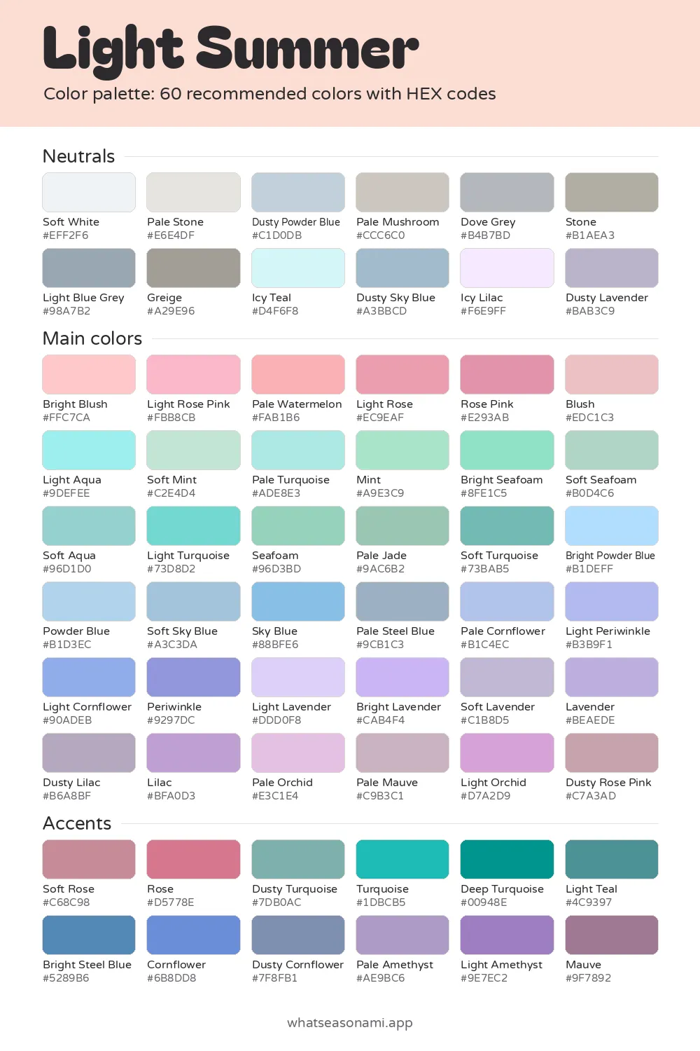
This light summer color palette holds 60 colors that are cool, soft and airy, made for fair, low-contrast coloring that deep or heavy tones can easily overwhelm.
Light Summer neutrals
- Icy Lilac
- Soft White
- Icy Teal
- Pale Stone
- Dusty Powder Blue
- Pale Mushroom
- Dusty Lavender
- Dove Grey
- Dusty Sky Blue
- Stone
- Light Blue Grey
- Greige
Light Summer main colors
Reds and pinks
- Bright Blush
- Light Rose Pink
- Blush
- Pale Watermelon
- Light Rose
- Rose Pink
- Dusty Rose Pink
Greens
- Soft Mint
- Mint
- Soft Seafoam
- Bright Seafoam
- Seafoam
- Pale Jade
Blues and teals
- Bright Powder Blue
- Light Periwinkle
- Powder Blue
- Pale Cornflower
- Pale Turquoise
- Light Aqua
- Soft Sky Blue
- Light Cornflower
- Sky Blue
- Periwinkle
- Soft Aqua
- Pale Steel Blue
- Light Turquoise
- Soft Turquoise
Purples and berries
- Light Lavender
- Bright Lavender
- Pale Orchid
- Soft Lavender
- Lavender
- Pale Mauve
- Light Orchid
- Lilac
- Dusty Lilac
Light Summer accent colors
- Rose
- Soft Rose
- Dusty Turquoise
- Turquoise
- Deep Turquoise
- Light Teal
- Bright Steel Blue
- Dusty Cornflower
- Cornflower
- Pale Amethyst
- Light Amethyst
- Mauve
Free files: palette card (WebP), HEX list (CSV), Adobe swatches (ASE), Procreate part 1, Procreate part 2. Tap any HEX code to copy it.
Colors to avoid as a Light Summer
- Moss#647C36
- Dark Magenta#690053
- Bright Terracotta#D35725
- Dark Cognac#4A2100
- Jade#359B75
- Deep True Red#990015
- Bright Peach#FFC299
- Dark Emerald#004729
Among the summer seasons it's the lightest one, and each shade was picked so your face stays the center of attention rather than your outfit.
- Palette size: 60 colors
- Top neutral: Dove Grey
- Most flattering metals: silver, white gold
- Shades to avoid: 6
Light summer palette
Every one of the 60 colors shares 3 traits: they're light, they sit on the cool side, and they read soft instead of sharp. Light Summer counts as a neutral-cool season, so the colors drift toward blue and pink, but gently, never so far that they feel icy.
The third trait is clarity. It tells you how clean or muted a color appears, and yours are muted, the way colors look through a light haze. That softness fits coloring where skin, hair and eyes are close in depth, what people call low contrast.
Three groups make up the palette:
- Neutrals: 12 understated staples that carry you through coats, trousers, bags and daily wear
- Main colors: 36 airy pinks, aquas, mints, blues and lavenders that shine in tops and dresses
- Accents: 12 shades with a bit more strength for small touches
Each color carries a HEX code, a short mix of letters and numbers that pins down one exact color on a screen. Copy it whenever you want to match a shade while browsing shops online or working in a design tool.
Does this season match your coloring?
The shade glowing up through your skin from below, your undertone, runs cool pink or neutral cool here. You might see it in skin like:
- fair alabaster touched with cool pink
- light beige with a neutral, cool base
- soft ivory with a faint rosy flush in the cheeks
- light tan or cool olive that pairs happily with silver
Eyes here tend toward the light, cool end of things, with a misty, clouded look in the iris instead of sharp dark spokes. Think of a clear sky blue, a blue-grey, a soft seafoam green, a light grey ringed gently, or a light cool hazel.
Some everyday clues point here too. Soft cool pinks and baby blues wake your face up right away. Black worn near your face drains your skin and brings out dark circles. Silver jewelry sits quietly against your skin, while yellow gold turns brassy.
Light summer neutrals
In this palette, harsh black and stark white step aside for gentler choices: Soft White, Dove Grey, Pale Mushroom and Dusty Powder Blue. With basics this soft, your clothes can't steal attention from your face. Dove Grey is the season's best single neutral, which makes it a smart pick for a coat or suit you'll reach for often.
The full neutral range gives you options:
- Soft White and Pale Stone work well for shirts and lighter layers
- Dove Grey, Light Blue Grey and Stone can stand in whenever charcoal or black would feel too heavy
- Pale Mushroom and Greige serve as gentle taupe staples
- Dusty Powder Blue and Dusty Sky Blue when you want a blue basic
- Icy Teal, Icy Lilac and Dusty Lavender for a neutral that carries a whisper of color
Choosing main colors and accents
Wear the main colors nearest your face. The five shades that define this season are Light Rose Pink, Powder Blue, Soft Mint, Light Lavender and Pale Watermelon: any of them makes an easy starting point for a top.
The other main colors sort into a few families: Blush and Rose Pink on the pink side, Seafoam and Pale Jade among the greens and aquas, Sky Blue and Periwinkle among the blues, and Lilac and Pale Orchid among the purples.
Accents like Turquoise, Cornflower, Deep Turquoise and Mauve carry a touch more weight than the main colors. They're still yours to wear, so they suit scarves, shoes and other small pieces.
Colors to skip
Light, cool, soft coloring gets no help from these 6 shades: Moss, Dark Magenta, Bright Terracotta, Dark Cognac, Deep True Red and Dark Emerald.
Warm, heavy colors like moss, terracotta and cognac can pull your skin toward yellow. Deep shades such as true red, dark magenta and dark emerald swamp fair, low-contrast features, so the color gets noticed before you do.
Shopping in daylight
Cameras and artificial lighting indoors both change how skin and fabric appear. Before buying, take the garment into daylight and hold it beside a palette swatch saved on your phone. If the two look close, the piece belongs with you.
The files at the top of the page are built for exactly this. Keep the PNG palette card handy on your phone, or pull the Adobe ASE or Procreate files into whatever design tool you use.
Common questions
What if my job needs a dark suit: can I still wear black?
It's black near your face that drains you, so layer something soft and pale, like Soft White or Icy Lilac, under the jacket. When the choice is yours, a Dove Grey suit reads just as formal while staying in your best neutral.
Which lipstick colors work best here?
A dark lipstick takes over so people only notice your mouth. Lighter pinks from the palette, like Light Rose Pink or Blush, echo your own coloring far better.
Light Summer versus Light Spring: what sets them apart?
The two are both light, but they belong to different families. Light Summer comes from the cooler, softer summer branch, while Light Spring grows out of the spring side.
Which hair colors flatter this coloring?
Hair that grows in naturally with this season is usually a light ash blonde, a sandy blonde with cool highlights, an ash brown somewhere between light and medium, or a strawberry blonde with cool tones that drift toward ash over time. Cool, ashy shades like these keep to the palette's own light, gentle depth.
Still unsure whether Light Summer is you?
Treat a quiz as a first step only. Try holding colors up to your face in a mirror with natural daylight, or book a draping with a stylist, who places fabric swatches near your face and compares how each one treats your skin.