
Cool Winter color palette
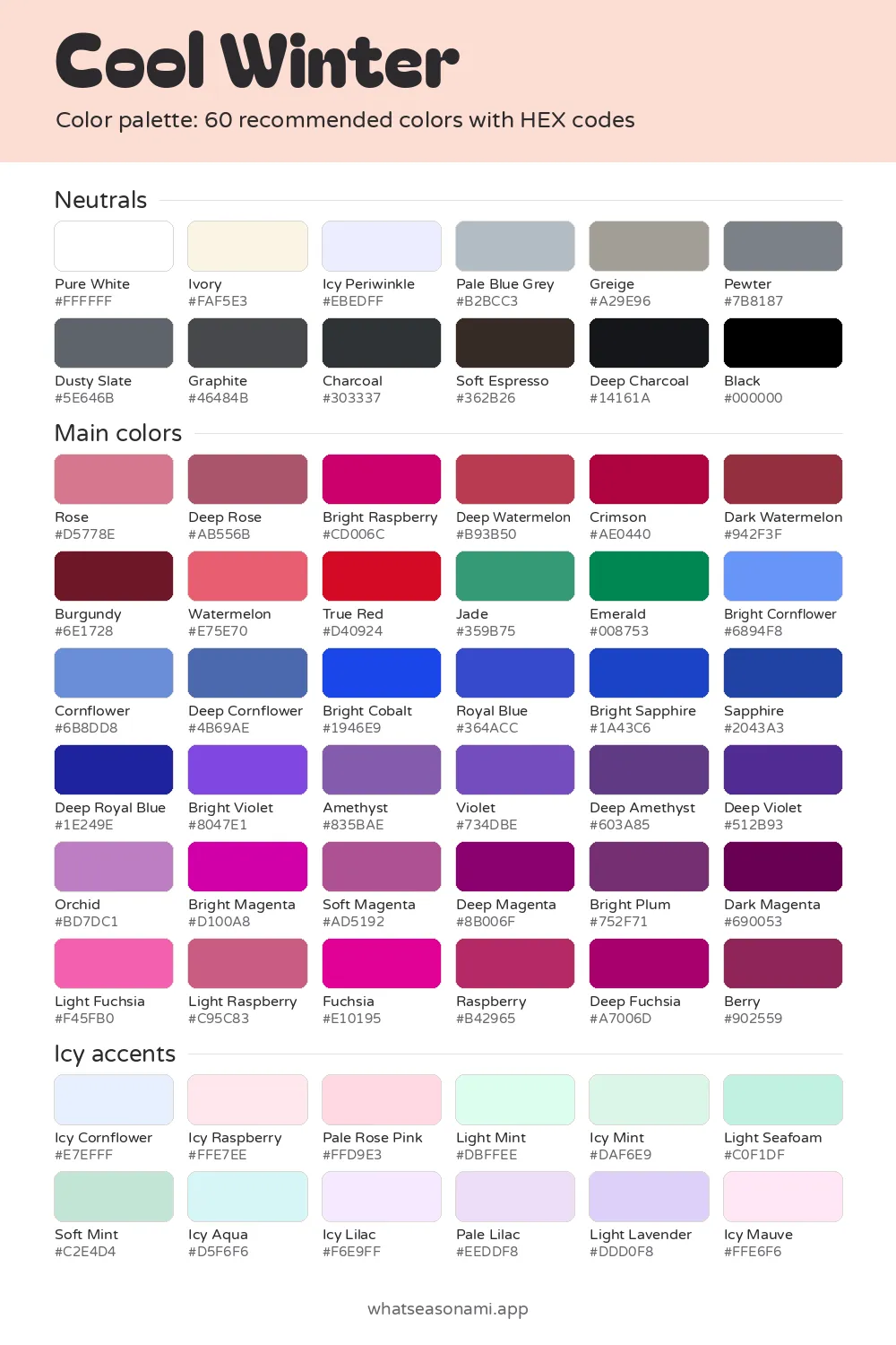
This cool winter color palette has 60 colors that are all cool and bright, chosen for people whose coloring has high contrast.
Cool Winter neutrals
- Pure White
- Icy Periwinkle
- Ivory
- Pale Blue Grey
- Greige
- Pewter
- Dusty Slate
- Graphite
- Charcoal
- Soft Espresso
- Deep Charcoal
- Black
Cool Winter main colors
Reds and pinks
- Rose
- Watermelon
- Light Raspberry
- Deep Rose
- Deep Watermelon
- True Red
- Raspberry
- Dark Watermelon
- Berry
- Crimson
- Burgundy
Greens
- Jade
- Emerald
Blues and teals
- Bright Cornflower
- Cornflower
- Bright Cobalt
- Royal Blue
- Deep Cornflower
- Bright Sapphire
- Sapphire
- Deep Royal Blue
Purples and berries
- Light Fuchsia
- Orchid
- Bright Violet
- Violet
- Amethyst
- Soft Magenta
- Fuchsia
- Bright Magenta
- Bright Raspberry
- Deep Amethyst
- Deep Violet
- Deep Fuchsia
- Bright Plum
- Deep Magenta
- Dark Magenta
Cool Winter icy accent colors
- Icy Raspberry
- Pale Rose Pink
- Light Mint
- Soft Mint
- Icy Mint
- Light Seafoam
- Icy Aqua
- Icy Cornflower
- Light Lavender
- Icy Lilac
- Pale Lilac
- Icy Mauve
Free files: palette card (WebP), HEX list (CSV), Adobe swatches (ASE), Procreate part 1, Procreate part 2. Tap any HEX code to copy it.
Colors to avoid as a Cool Winter
- Moss#647C36
- Deep True Red#990015
- Bright Peach#FFC299
- Peacock#00697B
- Aqua#65D2D2
- Bright Copper#D56400
- Pale Coral#FFC4B5
- Bright Periwinkle#989EF8
- Cool Winter palette: 60 named shades, sorted into 3 groups
- Also known as: True Winter
- Best neutral: Black
- Best metals: shiny silver and platinum
Think frosted tones, rich jewel blues, stark white and true black. The 60 colors divide up as 12 neutrals, 36 main colors and 12 pale icy accents. A short list of shades to pass over comes at the end too.
What the cool winter palette means, simply put
Every shade in this palette has 3 things in common. It's cool, meaning it leans blue rather than yellow. Its depth lands in the medium range. And it's bright, by which we mean clear and pure instead of dusty or muted.
Cool Winter belongs to the winter family. Inside that family, the season takes its name from its dominant trait, and that trait is coolness. Brightness is the second most important quality.
These colors were picked for high contrast coloring. In other words, your complexion stands apart from your hair and eyes. Clear, strong shades keep up with that gap instead of fighting it.
How to tell this season is yours
Your skin shows a clear blue or pink undertone and zero warmth. An undertone is the color beneath the surface of your skin, the hint of pink, blue or warmth that shows through.
Skin tones that often match this season:
- fair porcelain skin with a cool pink undertone
- light beige skin that flushes rosy
- medium olive skin that reads cool beside silver
- deep ebony or espresso skin with blue undertones
Hair is often blue black or jet black, deep ash brown with no red in it, medium cool brown, or bright silver or salt and pepper. The eyes tend to be clear and glassy, with vivid whites and a crisp ring around the iris. You might see pale icy blue, vivid violet blue, a clear grey eye, a grey-green eye rimmed in grey, or a deep cool brown.
You can test things in the mirror too:
- Fabrics in orange or warm peach drain the color from your skin and leave it looking tired.
- Pure white flatters your face, while cream turns dull on you.
- Crisp silver jewelry sits well against your skin, while gold fights it.
- Fuchsia and cobalt blue sharpen your eyes almost instantly.
- Black worn near your face feels natural, even without much makeup.
Is True Winter a separate season?
No, True Winter is just Cool Winter under another name, and both refer to the same 60 shades. Guides vary on which term they use, so if you got a True Winter result somewhere else, it lines up with these shades.
How to wear the cool winter neutrals
Neutrals are the quiet colors that form the base of your outfits, such as pants, jackets and everyday tops. Black leads the group, and Pure White delivers the sharp contrast this season is famous for. Wear the 2 side by side and you mirror the natural contrast in your face.
Brown trips up a lot of people. Warm brown has no place in this palette, so when you want a dark brown, go with Soft Espresso. For a grey you can wear daily, reach first for Pewter and Charcoal.
Here's the full set of 12, running from the palest to the deepest:
| Palest | Mid | Deepest |
|---|---|---|
| Ivory | Greige | Soft Espresso |
| Pure White | Pewter | Charcoal |
| Icy Periwinkle | Dusty Slate | Deep Charcoal |
| Pale Blue Grey | Graphite | Black |
Choosing your main colors
This group of 36 covers every red, pink, blue, green and purple you might wear as a top, dress or scarf. Each one is strong, clear and cool.
If you'd rather begin with just a few, the 5 signature colors (True Red, Emerald, Fuchsia, Icy Lilac and Bright Cobalt) are a smart first buy, since they capture this season at its most vivid.
All these shades sort into a handful of groups:
- The reds and pinks include Rose, Deep Rose, Crimson, True Red and Burgundy, plus the Watermelon, Raspberry and Fuchsia shade ranges, and Berry
- Jade and Emerald are your greens
- For blues, choose from Bright Cobalt, Royal Blue, Sapphire, the Cornflower shades, Bright Sapphire and Deep Royal Blue
- For purples, try Bright Plum, Orchid, the Magenta shades, or the Violet and Amethyst shades
Cobalt blue and fuchsia both work beautifully near your face, since they sharpen your eyes almost at once.
How to use the icy accents
Each of the 12 accents is a very pale shade with a distinct cool tint: think Icy Lilac, Icy Mint, Icy Aqua, plus Pale Rose Pink and Light Lavender. Use them when you want a lighter shirt or knit, or a small bright note next to the deeper neutral shades.
Since Icy Lilac sits among the 5 signature colors, it's an easy one to reach for first.
Shades to skip
Here are the 5 shades to pass over:
- Bright Peach
- Moss
- Aqua
- Pale Coral
- Bright Copper
Warmth is the issue. Your coloring contains no warmth, so orange and warm peach shades leave your skin looking worn out and dull. Jewelry follows the same rule: reach for bright silver or platinum, and pass on gold.
Taking the palette shopping on your phone
Cameras and indoor lighting both shift how colors appear, so daylight gives you the truest check. Before you head out, save the palette card to your phone. When you're shopping, hold the garment against the matching swatch by a window or outdoors and see if the two read as the same family.
Each swatch carries a HEX code: a short mix of letters and numbers that pinpoints one exact color on a screen. Copy it when you shop online or build something digital.
To make a final call, stand in daylight with the color held under your chin and look in a mirror. When your face looks fresher and your eyes sparkle more, the shade belongs with you. When your skin seems drained or dull, set it back on the rack.
Questions people often ask
Is navy an option when black feels too harsh?
Navy doesn't appear among the 60 colors here. If Black feels too stark, the darkest options this palette offers are Deep Royal Blue and Deep Charcoal.
Which pinks work best for lipstick and blush?
None of the pinks here come tagged for a particular use. On lips and cheeks, start with Rose, Deep Rose, Raspberry or Fuchsia. Test each against your face in daylight, since the same pink can read differently on your skin than it does on a screen.
How do the Adobe and Procreate files work?
The ASE file loads the swatches into Adobe programs. The Procreate swatches are split across 2 files, so grab both for the complete set. You also get a PNG palette card, a CSV with every HEX code, and a zip covering all 12 seasons.
How confident should I be in my Cool Winter result?
Treat a quiz as a rough starting point. You can confirm it with mirror checks in daylight or by having someone drape fabrics for you in person. During draping, someone places fabric colors under your chin one by one and compares how your face responds to each. If the result still doesn't feel right, try testing your undertone alone, or comparing gold against silver, to judge warmth by itself.