
Soft Autumn color palette
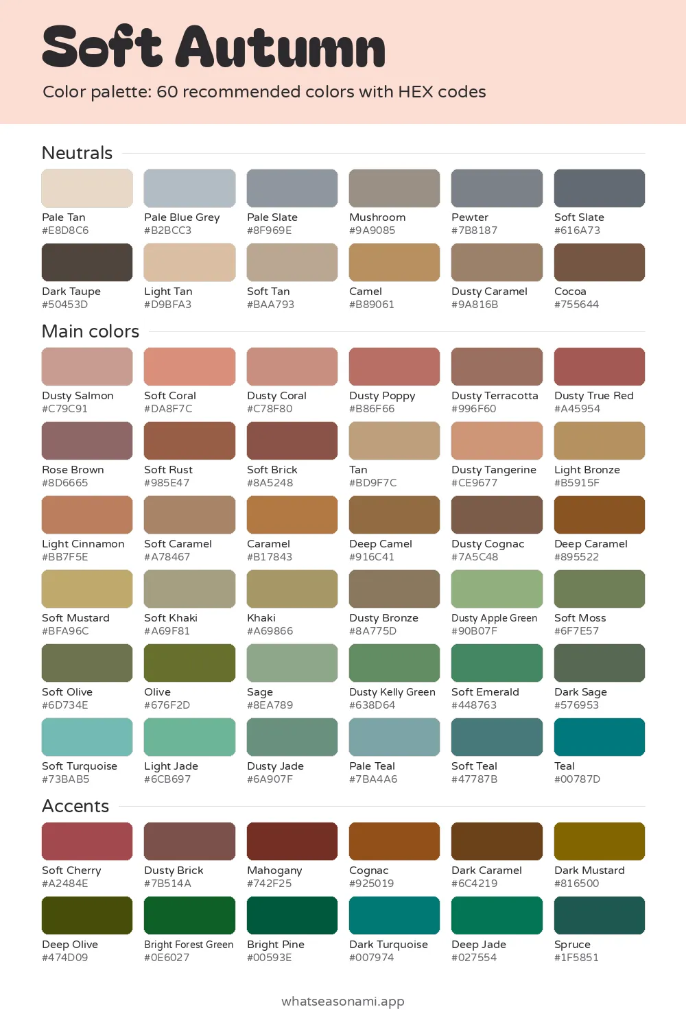
The soft autumn color palette has 60 muted, earthy colors made for warm or neutral skin that blends gently with your hair and eyes, so nothing about your face looks sharp or high-contrast.
Soft Autumn neutrals
- Pale Tan
- Light Tan
- Pale Blue Grey
- Soft Tan
- Pale Slate
- Mushroom
- Camel
- Dusty Caramel
- Pewter
- Soft Slate
- Cocoa
- Dark Taupe
Soft Autumn main colors
Reds and pinks
- Dusty Salmon
- Soft Coral
- Dusty Coral
- Dusty Poppy
- Dusty True Red
- Rose Brown
- Soft Brick
Oranges and browns
- Dusty Tangerine
- Tan
- Soft Mustard
- Light Cinnamon
- Light Bronze
- Soft Caramel
- Dusty Terracotta
- Caramel
- Dusty Bronze
- Soft Rust
- Deep Camel
- Dusty Cognac
- Deep Caramel
Golds and olives
- Soft Khaki
- Khaki
- Soft Olive
- Olive
Greens
- Sage
- Dusty Apple Green
- Light Jade
- Dusty Jade
- Dusty Kelly Green
- Soft Moss
- Soft Emerald
- Dark Sage
Blues and teals
- Soft Turquoise
- Pale Teal
- Soft Teal
- Teal
Soft Autumn accent colors
- Soft Cherry
- Mahogany
- Dusty Brick
- Cognac
- Dark Caramel
- Dark Mustard
- Deep Olive
- Bright Forest Green
- Bright Pine
- Deep Jade
- Spruce
- Dark Turquoise
Free files: palette card (WebP), HEX list (CSV), Adobe swatches (ASE), Procreate part 1, Procreate part 2. Tap any HEX code to copy it.
Colors to avoid as a Soft Autumn
- Black#000000
- Pale Turquoise#ADE8E3
- Magenta#C2009C
- Bright Cobalt#1946E9
- Jade#359B75
- Fuchsia#E10195
- Deep Royal Blue#1E249E
- Burgundy#6E1728
It sits at the mildest end of the warm seasons. The palette pairs earthy, softened tones with a hint of Summer's coolness, which suits people whose coloring has low contrast.
- Temperature: warm with a neutral feel
- How deep the colors are: medium
- How clear they are: soft
- Best metals: brushed gold and bronze
Is soft autumn your season?
This season belongs to the autumn family. Softness is its defining trait, and warmth comes right after. When your contrast is low, your skin, hair and eyes all sit near one another in depth, so no single feature jumps out.
Warm or neutral golden undertones run through the skin here. An undertone is the shade living beneath the surface, and it stays put whether you are pale or tanned. Skin for this season usually falls into one of these looks:
- a warm ivory or light beige base touched with soft gold
- medium neutral olive that bronzes easily in the sun
- a golden tan or caramel tone that looks muted and velvety
- deep warm brown holding soft golden or bronze undertones
Common hair shades are dark honey and mouse blonde carrying muted golden tones, or a medium golden brown alongside soft ash brown. Muted auburn and strawberry blonde without bright red also fit, as does deep espresso brown that shows warm bronze highlights in the sun.
The eyes usually look soft and blended. Instead of a sharp border, the colored part melts into the ring around it. Hazel eyes in this season often blend gentle greenish, brownish and golden tones; you may also see muted olive or sage, warm amber or light topaz, or soft gray blue dotted with warm gold.
Some everyday clues can help you spot this season:
- Black worn close to your face feels heavy and draws out the shadows beneath your eyes.
- Pure white comes across as too stark, while cream and tan even out your skin.
- Bright neon shades overpower your face, so the shirt gets noticed before you do.
- Brushed gold and bronze jewelry melt into your skin, while shiny silver feels cold.
- Muted greens such as sage and olive instantly make your eyes look clearer.
What the colors share
Warmth or neutral warmth, medium depth and softness describe every color here. Clarity is about how clean and bright a color appears. Soft clarity means each shade carries a slightly dusty, grayed look, which explains why so many of the names begin with "Dusty" or "Soft".
The 60 colors split into three sets: a dozen neutrals, the main colors and a dozen accents. Every color comes with a HEX code, a short mix of characters that apps and printers rely on to reproduce the exact shade.
Soft autumn neutrals
These 12 neutrals replace the black, white and gray that fill most wardrobes. Instead of harsh black, reach for Cocoa, and swap stark white for Pale Tan. When you need a simple gray, Mushroom or Pewter are good picks.
Mushroom is the top neutral here. Here is the full set:
- Light: Pale Tan, Light Tan, Pale Blue Grey and Pale Slate
- Medium: Mushroom, Pewter, Soft Slate, Soft Tan, Camel and Dusty Caramel
- Deep: Dark Taupe and Cocoa
Choosing your main colors and accents
You can use the main colors across larger pieces such as tops and dresses. The five signature shades of this season are Sage, Rose Brown, Dusty Terracotta, Soft Mustard and Soft Teal, and together they capture this palette in its most typical form.
Main colors fall into a few groups:
- Reds and corals with warmth: Dusty Salmon, Soft Coral, Dusty Poppy, Dusty Coral, Dusty Terracotta, Dusty True Red, Rose Brown, Soft Rust and Soft Brick. Wear these in tops and dresses near your face, and save the richer accents like Mahogany or Spruce for a scarf, a bag or one statement piece.
- Shades of brown and gold: Tan, Light Bronze, Dusty Tangerine, Light Cinnamon, Caramel, Deep Camel, Dusty Cognac, Deep Caramel, Soft Caramel, Soft Mustard, Soft Khaki, Khaki and Dusty Bronze
- Shades of green: Soft Moss, Dusty Apple Green, Olive, Soft Olive, Sage, Dusty Kelly Green, Dark Sage and Soft Emerald
- Blues with green in them: Soft Turquoise, Dusty Jade, Light Jade, Teal, Pale Teal and Soft Teal
The 12 accents are richer and deeper than the rest: Soft Cherry, Mahogany, Dusty Brick, Cognac, Dark Mustard, Dark Caramel, Deep Olive, Bright Forest Green, Bright Pine, Dark Turquoise, Spruce and Deep Jade.
Shades to pass over
Six colors land on the skip list: Black, Magenta, Bright Cobalt and Fuchsia, along with Deep Royal Blue and Burgundy. Each one reads as overly dark, cool or bright for this gentle, low-contrast coloring.
Black worn near the face feels heavy and brings out the shadows under your eyes. Vivid shades like Magenta, Fuchsia and Bright Cobalt pull attention onto the clothes and away from you. When you want a dark shade, Cocoa flatters your skin instead.
Is muted autumn just another name?
Yes. Muted Autumn is simply what people also call Soft Autumn. Both labels point to the same 60 colors and the same kind of coloring, so feel free to use either one while shopping for clothes or makeup.
Checking colors in daylight
Bulbs indoors and phone cameras both change how a color appears. Looking at things in daylight fixes that.
- Pull up the palette on your phone, keeping the swatches handy while you shop.
- Carry the garment to a window or head outside, since daylight reveals a fabric's true color.
- Place the fabric beside the nearest swatch and notice how dusty or bright each one seems.
- Pick the piece only if it seems as soft as the swatch, because a much brighter or darker version will sit outside the palette.
The free files help here too. You can download a PNG palette card to keep on your phone, a CSV list of every HEX code, an Adobe ASE swatch file and Procreate swatches (two files). If you want every season, there's also a zip with all 12.
Common questions
How does this differ from true autumn?
Every family holds 3 seasons, and each season is named after its strongest trait. For Soft Autumn that trait is softness, with warmth in second place. True Autumn is named for warmth instead. Soft Autumn also borrows some cool, soft qualities from Summer, and that is why its colors appear more muted.
How confident can I be that Soft Autumn is my season?
Treat any quiz as a starting point. Trying colors beside your face in a daylight mirror can help you confirm it. A stylist can also drape fabric swatches under your face in person, which works as confirmation too.