
Soft Summer color palette
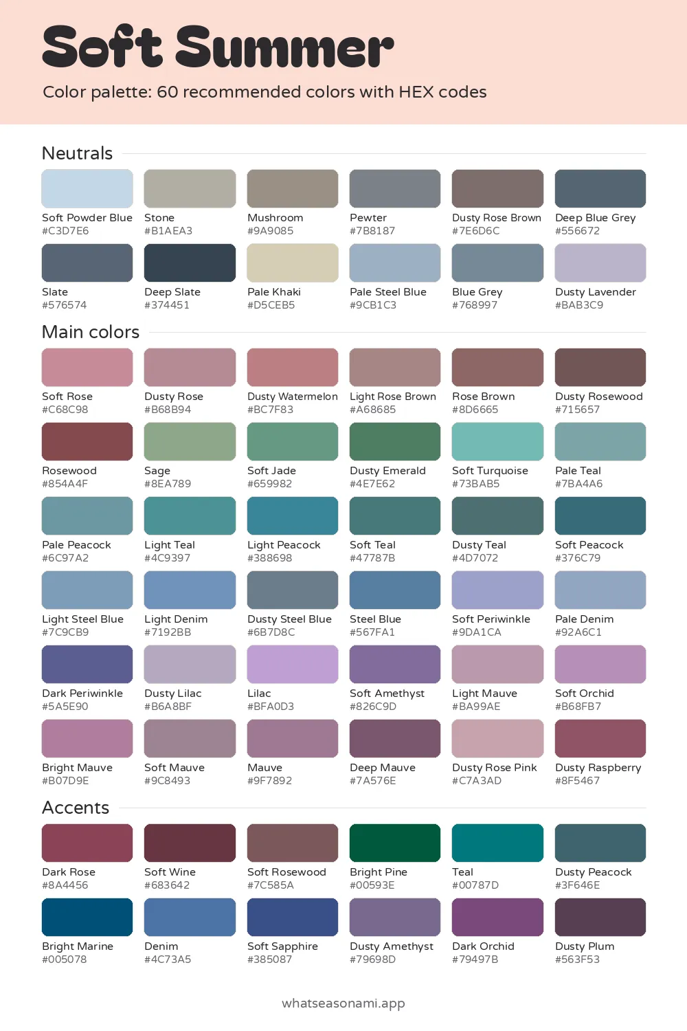
The Soft Summer color palette has 60 cool, calm, greyed shades for people whose hair, skin and eyes look gentle and blend into one another.
Soft Summer neutrals
- Soft Powder Blue
- Pale Khaki
- Dusty Lavender
- Pale Steel Blue
- Stone
- Mushroom
- Blue Grey
- Pewter
- Dusty Rose Brown
- Slate
- Deep Blue Grey
- Deep Slate
Soft Summer main colors
Reds and pinks
- Dusty Rose Pink
- Soft Rose
- Dusty Rose
- Dusty Watermelon
- Light Rose Brown
- Rose Brown
- Dusty Raspberry
- Rosewood
- Dusty Rosewood
Greens
- Sage
- Soft Jade
- Dusty Emerald
Blues and teals
- Soft Periwinkle
- Pale Denim
- Light Steel Blue
- Soft Turquoise
- Light Denim
- Pale Teal
- Pale Peacock
- Dusty Steel Blue
- Steel Blue
- Dark Periwinkle
- Light Teal
- Light Peacock
- Soft Teal
- Dusty Teal
- Soft Peacock
Purples and berries
- Lilac
- Dusty Lilac
- Light Mauve
- Soft Orchid
- Bright Mauve
- Soft Mauve
- Mauve
- Soft Amethyst
- Deep Mauve
Soft Summer accent colors
- Dark Rose
- Soft Wine
- Soft Rosewood
- Bright Pine
- Teal
- Dusty Peacock
- Bright Marine
- Denim
- Soft Sapphire
- Dusty Amethyst
- Dark Orchid
- Dusty Plum
Free files: palette card (WebP), HEX list (CSV), Adobe swatches (ASE), Procreate part 1, Procreate part 2. Tap any HEX code to copy it.
Colors to avoid as a Soft Summer
- Gold#D4A73E
- Bright Royal Blue#3743F7
- Bright Fuchsia#F0009F
- Navy#172A5A
- Aqua#65D2D2
- True Red#D40924
- Sunflower#F6C330
- Bright Kelly Green#00A62C
It sits within the summer family, and its other name is Muted Summer.
- Colors: 60 in all, spread across neutrals, main colors and accents
- Top neutral: Pewter
- Top metals: brushed silver plus pewter
- Other name: Muted Summer
What these 60 shades share
Three traits show up in every color of this season. The first is coolness, with a faintly neutral edge. The second is medium depth: most shades sit in the middle, and even the lightest and darkest ones stay soft rather than stark. The third is softness, meaning grey runs through each shade and mutes it instead of leaving it clear and bright.
Softness is the defining trait here, and coolness follows behind. Together they flatter faces with low contrast, where your hair, skin and eyes land near each other on the light-to-dark scale. Sharp, vivid colors fight against that gentle impression, but greyed shades harmonize with that softness.
Is soft summer your season?
Your skin carries a cool undertone with a slight neutral bend, and it often has a velvety finish. The undertone is that subtle color living beneath your skin's surface, and it holds steady through every shade of pale or tan. Skin in this season often looks like one of these:
- fair beige skin with a pinkish or greyish cast
- olive skin, light to medium and neutral in tone, that tans readily
- medium tan skin with beige undertones on the cool side
- deep brown skin, cool in tone, with a surface that reads soft and gently muted
Hair here often runs ashy and dark blonde without any golden warmth, or light to medium mouse brown, or medium brown with a cool ash cast, or soft charcoal brown fading toward muted black. Eyes have a misty quality, like frosted glass. Common shades include misty grey blue, sage or green muted by grey, cool hazel touched with grey and soft brown, and cocoa brown with a hazy ring.
A few mirror signs point clearly toward this season:
- Pure black steals color from your face and brings out shadows under your eyes.
- Vivid neon shades overpower you, so the shirt gets noticed before you do.
- Dusty rose and sage green leave your skin looking smooth and rested.
- Brushed silver and pewter sit quietly against your skin, while yellow gold turns brassy.
- Warm orange and bright yellow can leave your face sallow or washed out.
A mirror test in daylight, or a draping session in person, can confirm what those clues reveal.
Everyday neutrals for this season
The 12 neutrals cover coats, trousers, shoes, bags and daily tops. The lineup starts with Soft Powder Blue, Stone, Mushroom and Pewter, then moves through Dusty Rose Brown, Deep Blue Grey, Slate and Deep Slate, before finishing with Pale Khaki, Pale Steel Blue, Blue Grey and Dusty Lavender.
Pewter earns its spot as the best neutral because it pairs well with nearly everything else here. When black is your usual choice, reach for Deep Slate instead, since it gives a dark base without weighing things down. If you want a light shirt that feels crisp without turning harsh, Stone steps in where pure white would go.
When you want a brown, choose Mushroom or Dusty Rose Brown rather than a warm one. Both keep the palette's cool, greyed character, so they blend smoothly with this palette's pinks, teals and blues.
Picking main colors
Wear the main colors close to your face most often: in tops, dresses, knitwear and scarves. They sort into four groups:
- Pinks and rose browns: Soft Rose, Dusty Rose, Dusty Watermelon, plus Rose Brown and Rosewood
- Greens and teals: Sage, Soft Jade, Dusty Emerald, Soft Teal, Dusty Teal
- Blues and periwinkles: Light Steel Blue, Light Denim, Steel Blue, Soft Periwinkle
- Purples and mauves: Dusty Lilac, Soft Amethyst, Soft Orchid, Mauve, Dusty Raspberry
The signature shades are Dusty Rose, Sage, Soft Mauve, Dusty Teal and the accent Soft Wine. If you're building a wardrobe from scratch, start with these, because they show this season at its clearest.
Accent colors
Twelve accents make up the deepest, richest shades the palette offers. The group opens with Dark Rose, Soft Wine, Soft Rosewood and Bright Pine, continues with Teal, Dusty Peacock, Bright Marine and Denim, and closes with Soft Sapphire, Dusty Amethyst, Dark Orchid and Dusty Plum.
Soft Wine leads the accents. Reach for one on a jacket, party dress or handbag when the main colors feel too light but you want the look to stay true to your coloring.
Colors to skip
Six shades clash with a cool, gentle coloring: Gold, Bright Royal Blue, Bright Fuchsia, True Red, Sunflower and Bright Kelly Green.
The blue, fuchsia, red and kelly green entries are all too loud and clear, so the color draws the eye before your face does. Gold and Sunflower bring warmth and yellow, which can leave your skin sallow or washed out. When a red is what you're after, Soft Wine and Dusty Raspberry are there for you, and Sage or Soft Jade can fill in for a bright green.
Shopping with the palette
Store lighting and phone cameras both distort color, so trust daylight most.
- Before you head out, open the palette on your phone and choose the swatches you want to compare against.
- Bring the garment to a window or step outside, since indoor bulbs change how fabric reads.
- Put your phone screen beside the fabric and compare them directly.
- Check that the dye has a soft, greyed feel. Anything that looks more vivid or more yellow next to the swatch will probably feel loud on you.
Each color in the palette comes with a HEX code, a 6-character string of letters and numbers that pins down one exact shade on screen. It's a useful tool for matching colors when you shop online or work in design apps.
Questions people ask
How is this season different from soft autumn?
Softness defines both seasons, so both work with greyed, gentle colors. Soft Summer sits in the summer camp and tilts cool, while soft autumn comes from the autumn camp. If silver blends into your skin while gold turns brassy, that points you here.
Is black still an option for work or formal events?
Yes, though pure black tends to pull color from your face and deepen the hollows beneath your eyes. For the same smart, dark effect in a gentler way, choose Deep Slate or Deep Blue Grey. If black is your choice, keep it off your face, in trousers or a skirt for instance.
Which denim washes work best?
Among this palette's denim shades (Pale Denim, Light Denim and Denim) the best match for the rest is a soft, gently greyed blue wash, while a very bright blue sits too close to Bright Royal Blue, which this season leaves out.